Background
Amazon Freight and Amazon Shipping were undergoing a two-phase transformation. Phase one focused on migrating from a legacy CMS to Brightspot. Phase two presented a larger opportunity: rethink the UX, modernize the visual system, and unify the two sister sites under Amazon Transportation.
Although both programs serve related audiences, they continued operating on separate templates even after migration, resulting in inconsistent experiences and duplicated development effort.
The problem
Maintaining separate templates meant that any new component required double the design and development investment. The sites also suffered from fragmented content strategies, buried operational details, friction in lead routing, and limited interactive tooling for shippers.
Critical information was often hidden behind downloadable PDFs, accessibility standards needed strengthening, and the overall brand perception did not reflect the scale or innovation of Amazon Transportation. Additionally, international pages lacked structure and readability, making global scalability a challenge.
The Goal
Design a unified, scalable system that brings Amazon Freight and Amazon Shipping into alignment- visually, functionally, and structurally.
The redesign aimed to:
- Establish a shared design system and template to reduce inefficiency
- Improve transparency by surfacing critical shipping information directly on-site
- Reduce friction through smarter routing and clearer CTAs
- Introduce value-driven tools like a pricing calculator and interactive coverage map
- Meet WCAG AA accessibility standards
- Create a flexible foundation that scales internationally
The result is a cohesive, modernized experience that elevates brand perception while better serving shippers of all sizes.
Research Synthesis
Affinity mapping shipper priorities
Following shipper and stakeholder interviews, I conducted affinity mapping to group behaviors, priorities, and barriers across small, medium, and enterprise segments. This helped clarify where needs diverge and where they align.
Segment distinctions emerged clearly:
- Small shippers typically manage shipping through e-commerce platforms or free integrators and prioritize low cost above all, with reliability and speed as secondary considerations.
- Medium shippers often leverage 3PLs or third-party integrators to access volume-discounted rates and expect seamless platform integrations.
- Enterprise shippers negotiate directly with carriers, value dedicated customer service, and rely on scheduled warehouse pickups.
Despite operational differences, several shared themes cut across all segments:
- Offering free or incentivized ground shipping to increase conversion
- Using a carrier mix to optimize strengths and coverage
- Paying for expedited or secondary carriers in edge cases
- Prioritizing reliability during peak seasons
This synthesis also clarified competitive opportunities. Amazon Shipping’s Sunday delivery and photo confirmation for ground shipments address gaps left by traditional carriers- differentiators that warranted stronger visibility in the redesigned experience.
These findings directly informed messaging clarity, CTA routing, pricing transparency, coverage visibility, and feature prioritization throughout the redesign.
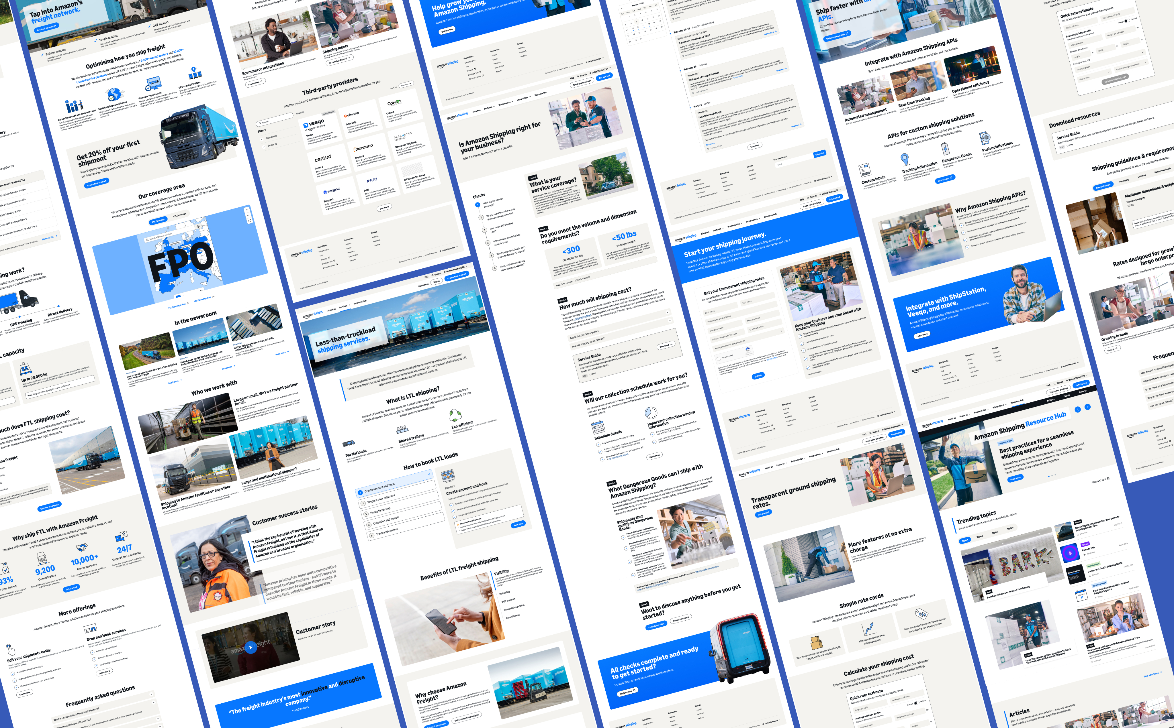
Inspiration
Laying the visual foundation
At the outset of this project, I conducted a visual and interaction research phase to inform the design language and interaction patterns. I gathered examples from both industry peers and standout digital brands (including enterprise platforms and consumer experiences) to understand how professional, dynamic, and intuitive interfaces are crafted.
The mood board includes:
- Website layout and content structure inspiration from both competitors and category leaders
- Design systems and component behavior that convey clarity and polish
- Mobile-first and responsive patterns that translate complex content to smaller screens
- Micro-interaction and animation examples that enhance usability without distraction
These visual references grounded early decisions around hierarchy, rhythm, motion, and interaction — helping ensure the Freight and Shipping redesign felt modern, purposeful, and aligned with user expectations. Screenshots shown reflect patterns that influenced component design, layout choices, and interaction cadence throughout the project.
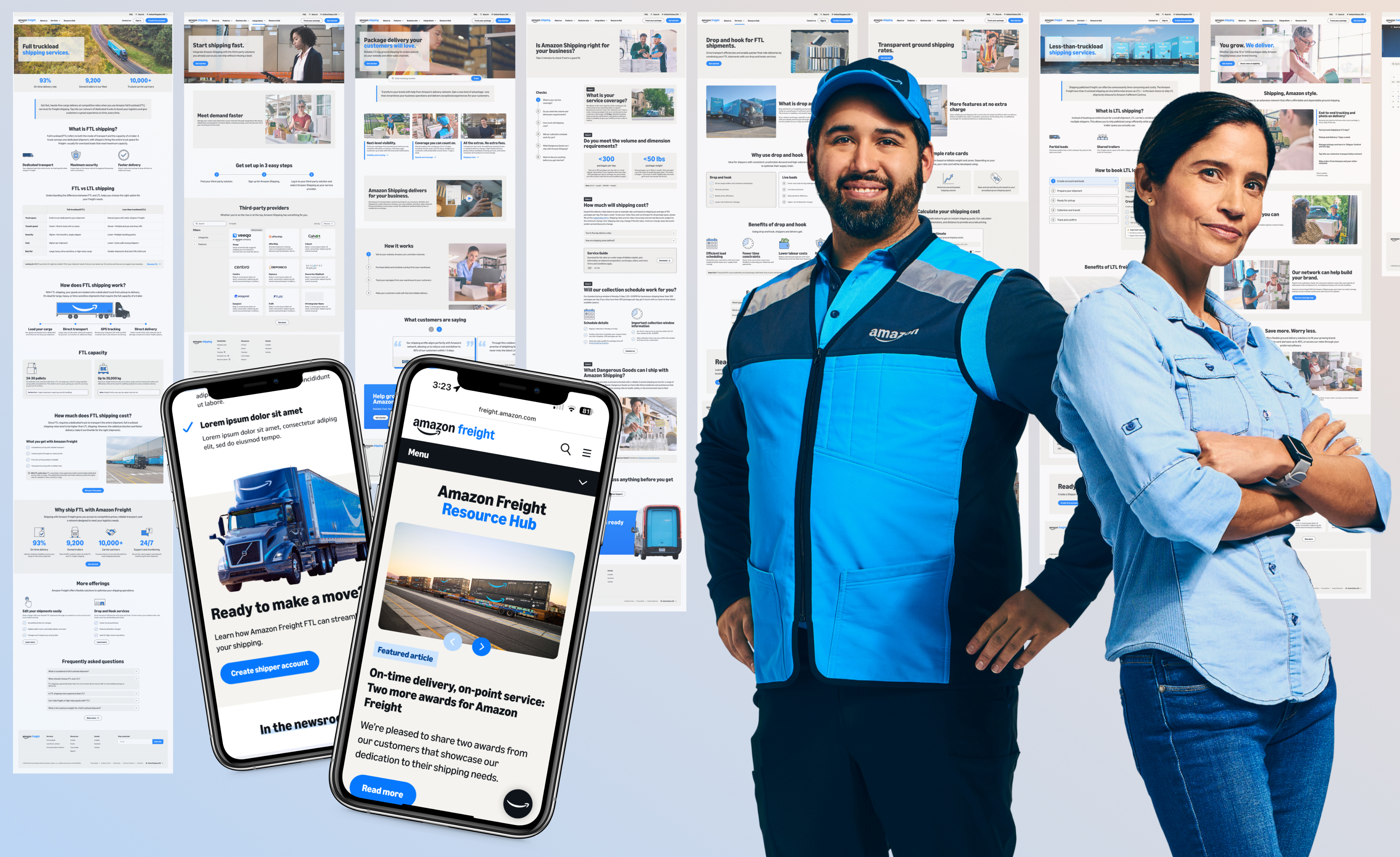
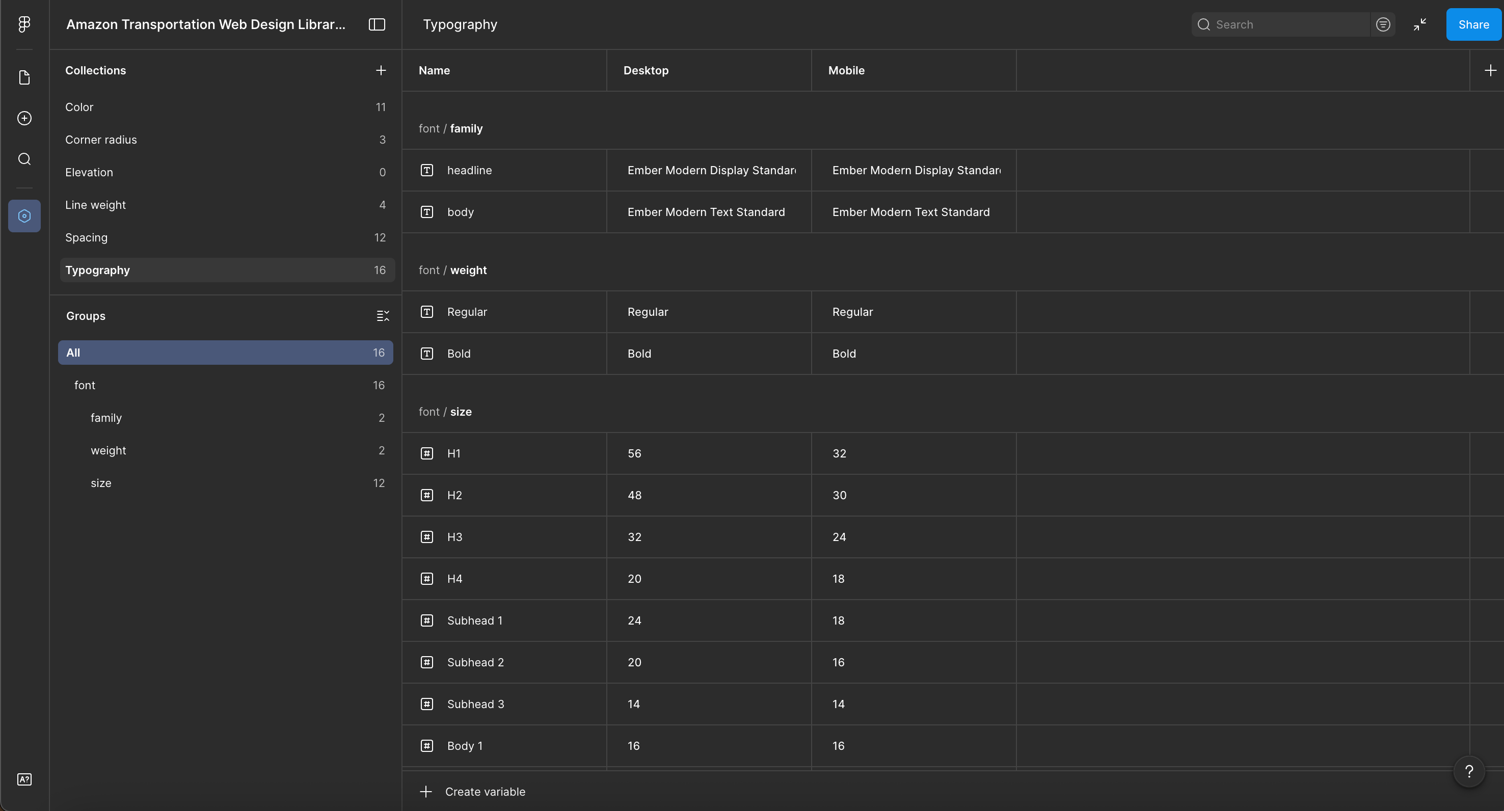
Design system
To support the Freight and Shipping redesign, I built a unified web design system in Figma from the ground up. It includes foundational tokens for color, typography, spacing, and layout, along with fully built components such as buttons, inputs, accordions, dropdowns, toggles, and carousels, all defined across interactive states.
Each component page is paired with usage guidance, do’s and don’ts, and accessibility notes directly inside the kit. This reduces ambiguity in implementation and ensures consistency across teams.
By creating a shared system for both sister sites, we eliminated the inefficiency of maintaining two separate templates. New components only need to be designed and developed once, then deployed across properties, reducing duplicate effort, speeding up delivery, and lowering long-term maintenance costs.
Micro interactions
I used micro-interactions to elevate the experience without adding noise. Hover states, subtle motion, animated transitions, and responsive feedback were designed to clarify intent and reinforce hierarchy — not distract from it.
Every interaction was purposeful. Buttons respond clearly, accordions transition smoothly, filters provide immediate feedback, and dynamic components guide the eye through complex information. The goal was to introduce moments of polish and confidence while keeping the experience efficient and frustration-free for enterprise shippers.
Unified Amazon Freight CTA
Reducing friction through smart routing
Previously, Amazon Freight surfaced two primary CTAs throughout the site: Contact Enterprise Sales and Create Shipper Account. With no context or qualification criteria, users were left to guess which path applied to them. This led to SMB customers contacting enterprise sales and enterprise shippers signing up through Freight Central, creating confusion, requiring sales to reroute leads, and reducing operational efficiency.
I redesigned this flow into a single, unified CTA: Ship With Us. When selected, users are prompted to self-identify their annual domestic transportation spend. Based on their selection, they are automatically routed to the appropriate experience; Freight Central for SMB shippers or Enterprise Sales for high-volume customers (>$25M annually).

This approach removes ambiguity, reduces internal rerouting, and creates a more confident, streamlined entry point into the Freight ecosystem, allowing users to move forward without second-guessing the path.
Shipping pricing calculator
From static tables to smart estimates
The existing experience relied on stacked accordions and static rate tables, requiring shippers to manually cross-reference weight and distance to estimate cost. It didn’t account for dimensional differences, packaging types, dangerous goods, drop-off methods, or potential surcharges, leaving users to interpret policies and calculate adjustments themselves.
I replaced this with an interactive pricing calculator that removes the guesswork. Shippers can input weight, dimensions, packaging type, shipment method, and hazardous materials to receive a realistic estimate including applicable fees. The tool supports both an average shipment view and a detailed, per-package breakdown for more complex loads.
The result is faster decision-making, greater transparency, and a pricing experience that feels built around how shippers actually operate, not around a static rate chart.
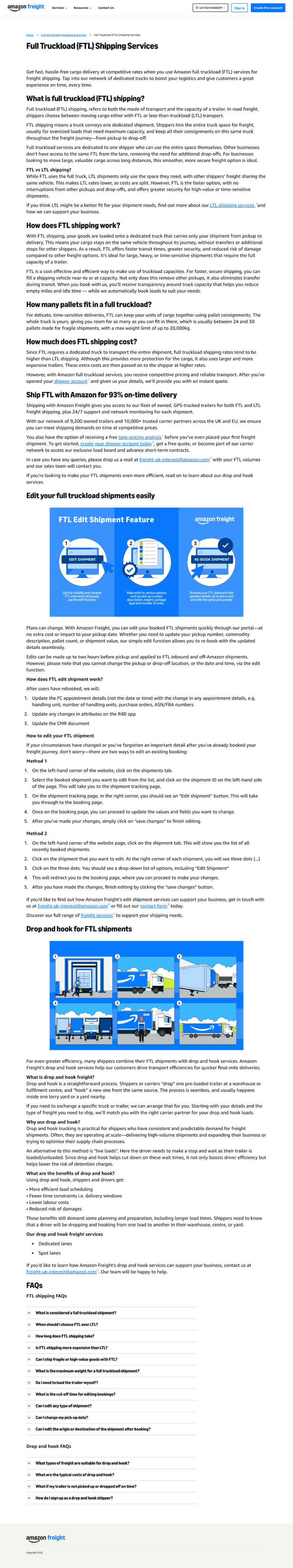
Shipping Guidelines
Making requirements visible, not hidden
Critical shipping requirements were previously buried inside a downloadable service guide that wasn’t prominently surfaced on the site. Weight and dimension limits, labeling standards, pallet instructions, dangerous goods policies, sealing requirements, and potential fees were easy to miss- even though they directly impact whether a shipment is accepted and how much it costs.
After I spoke personally with a shipping operations stakeholder, it became clear this information should be plainly visible and easily scannable online. I designed a structured Shipping Guidelines module with tabbed categories (Size & Weight, Packaging, Labeling, Dangerous Goods, Pallets) that clearly outlines restrictions, best practices, and applicable surcharges.
By bringing operational requirements into the primary web experience, we increase transparency, reduce avoidable errors, and better support shippers before they ever book a shipment.
Interactive Coverage Map
From static image to usable tool
The previous experience relied on static PNG maps- in some cases hidden behind a download- offering only a high-level view of coverage areas. Users couldn’t zoom in, verify edge-case locations like if their address landed on the border of a pickup radius, or understand what a specific region meant for their shipment.
I introduced an interactive map component that transforms coverage into a usable tool. Users can zoom, pan, and search by address to instantly see whether a location falls within our delivery area or pickup radius. Sort centers are clickable, revealing contextual details like address, hours, service radius, and whether pickup or drop-off is supported. A clear legend reinforces service boundaries and coverage types.
This shift makes coverage actionable instead of abstract, helping shippers confidently determine eligibility without guesswork or manual interpretation of a static image.
Resource Hub
Centralizing content for greater visibility
Previously, content lived in siloed experiences; separate landing pages for articles, newsroom updates, events, and downloadable reports, all nested independently under the Resources navigation. This fragmented structure made it difficult to highlight priority content and limited cross-discovery between content types.
In response, I designed a centralized Resource Hub: a single landing page that brings together articles, events, case studies, reports, and podcasts into one curated experience. Marketers can feature priority content across categories, spotlight the latest releases, and drive engagement more strategically.
The hub also includes secondary navigation that links to dedicated micro landing pages for each content type. Users who want to browse only articles or only events can still access filtered, sortable, and paginated views tailored to that format.
This structure balances discoverability with depth, unifying the content ecosystem while preserving flexibility for focused exploration.
International Scalability
Elevating regional experiences
As part of ensuring the system could scale globally, I redesigned regional experiences such as the UK Amazon Freight site. The existing pages relied heavily on long, full-width paragraphs with minimal visual interruption, resulting in excessive line lengths, low scannability, and limited engagement.
I restructured these pages to improve readability and hierarchy. Redundant content was consolidated, high-priority metrics were elevated into prime visual real estate, and dense copy was broken into structured modules and interactive components. This reduced cognitive load and made key information easier to scan and digest.
Hover over the mockup and scroll to see more of the design.
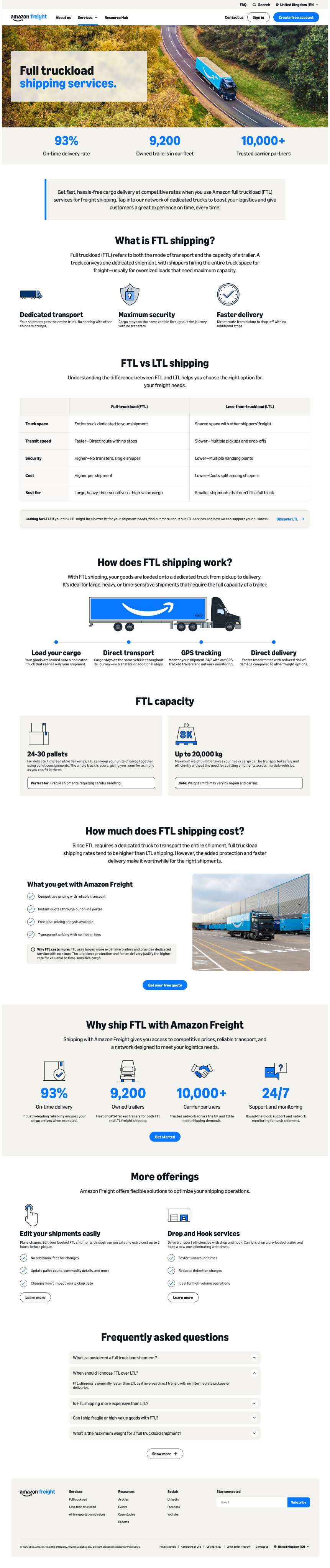
By applying the shared design system and modern layout patterns to regional sites, we created a more cohesive global presence while significantly improving clarity and usability for international shippers.
Amazon Shipping (US) prototype
Background
Amazon Freight and Amazon Shipping were undergoing a two-phase transformation. Phase one focused on migrating from a legacy CMS to Brightspot. Phase two presented a larger opportunity: rethink the UX, modernize the visual system, and unify the two sister sites under Amazon Transportation.
Although both programs serve related audiences, they continued operating on separate templates even after migration, resulting in inconsistent experiences and duplicated development effort.
The problem
Maintaining separate templates meant that any new component required double the design and development investment. The sites also suffered from fragmented content strategies, buried operational details, friction in lead routing, and limited interactive tooling for shippers.
Critical information was often hidden behind downloadable PDFs, accessibility standards needed strengthening, and the overall brand perception did not reflect the scale or innovation of Amazon Transportation. Additionally, international pages lacked structure and readability, making global scalability a challenge.
The Goal
Design a unified, scalable system that brings Amazon Freight and Amazon Shipping into alignment- visually, functionally, and structurally.
The redesign aimed to:
- Establish a shared design system and template to reduce inefficiency
- Improve transparency by surfacing critical shipping information directly on-site
- Reduce friction through smarter routing and clearer CTAs
- Introduce value-driven tools like a pricing calculator and interactive coverage map
- Meet WCAG AA accessibility standards
- Create a flexible foundation that scales internationally
The result is a cohesive, modernized experience that elevates brand perception while better serving shippers of all sizes.
Research Synthesis
Affinity mapping shipper priorities
Following shipper and stakeholder interviews, I conducted affinity mapping to group behaviors, priorities, and barriers across small, medium, and enterprise segments. This helped clarify where needs diverge and where they align.
Segment distinctions emerged clearly:
- Small shippers typically manage shipping through e-commerce platforms or free integrators and prioritize low cost above all, with reliability and speed as secondary considerations.
- Medium shippers often leverage 3PLs or third-party integrators to access volume-discounted rates and expect seamless platform integrations.
- Enterprise shippers negotiate directly with carriers, value dedicated customer service, and rely on scheduled warehouse pickups.
Despite operational differences, several shared themes cut across all segments:
- Offering free or incentivized ground shipping to increase conversion
- Using a carrier mix to optimize strengths and coverage
- Paying for expedited or secondary carriers in edge cases
- Prioritizing reliability during peak seasons
This synthesis also clarified competitive opportunities. Amazon Shipping’s Sunday delivery and photo confirmation for ground shipments address gaps left by traditional carriers- differentiators that warranted stronger visibility in the redesigned experience.
These findings directly informed messaging clarity, CTA routing, pricing transparency, coverage visibility, and feature prioritization throughout the redesign.
Inspiration
Laying the visual foundation
At the outset of this project, I conducted a visual and interaction research phase to inform the design language and interaction patterns. I gathered examples from both industry peers and standout digital brands (including enterprise platforms and consumer experiences) to understand how professional, dynamic, and intuitive interfaces are crafted.
The mood board includes:
- Website layout and content structure inspiration from both competitors and category leaders
- Design systems and component behavior that convey clarity and polish
- Mobile-first and responsive patterns that translate complex content to smaller screens
- Micro-interaction and animation examples that enhance usability without distraction
These visual references grounded early decisions around hierarchy, rhythm, motion, and interaction — helping ensure the Freight and Shipping redesign felt modern, purposeful, and aligned with user expectations. Screenshots shown reflect patterns that influenced component design, layout choices, and interaction cadence throughout the project.
Design system
To support the Freight and Shipping redesign, I built a unified web design system in Figma from the ground up. It includes foundational tokens for color, typography, spacing, and layout, along with fully built components such as buttons, inputs, accordions, dropdowns, toggles, and carousels, all defined across interactive states.
Each component page is paired with usage guidance, do’s and don’ts, and accessibility notes directly inside the kit. This reduces ambiguity in implementation and ensures consistency across teams.
By creating a shared system for both sister sites, we eliminated the inefficiency of maintaining two separate templates. New components only need to be designed and developed once, then deployed across properties, reducing duplicate effort, speeding up delivery, and lowering long-term maintenance costs.
Micro interactions
I used micro-interactions to elevate the experience without adding noise. Hover states, subtle motion, animated transitions, and responsive feedback were designed to clarify intent and reinforce hierarchy — not distract from it.
Every interaction was purposeful. Buttons respond clearly, accordions transition smoothly, filters provide immediate feedback, and dynamic components guide the eye through complex information. The goal was to introduce moments of polish and confidence while keeping the experience efficient and frustration-free for enterprise shippers.
Unified Amazon Freight CTA
Reducing friction through smart routing
Previously, Amazon Freight surfaced two primary CTAs throughout the site: Contact Enterprise Sales and Create Shipper Account. With no context or qualification criteria, users were left to guess which path applied to them. This led to SMB customers contacting enterprise sales and enterprise shippers signing up through Freight Central, creating confusion, requiring sales to reroute leads, and reducing operational efficiency.
I redesigned this flow into a single, unified CTA: Ship With Us. When selected, users are prompted to self-identify their annual domestic transportation spend. Based on their selection, they are automatically routed to the appropriate experience; Freight Central for SMB shippers or Enterprise Sales for high-volume customers (>$25M annually).

This approach removes ambiguity, reduces internal rerouting, and creates a more confident, streamlined entry point into the Freight ecosystem, allowing users to move forward without second-guessing the path.
Shipping pricing calculator
From static tables to smart estimates
The existing experience relied on stacked accordions and static rate tables, requiring shippers to manually cross-reference weight and distance to estimate cost. It didn’t account for dimensional differences, packaging types, dangerous goods, drop-off methods, or potential surcharges, leaving users to interpret policies and calculate adjustments themselves.
I replaced this with an interactive pricing calculator that removes the guesswork. Shippers can input weight, dimensions, packaging type, shipment method, and hazardous materials to receive a realistic estimate including applicable fees. The tool supports both an average shipment view and a detailed, per-package breakdown for more complex loads.
The result is faster decision-making, greater transparency, and a pricing experience that feels built around how shippers actually operate, not around a static rate chart.
Shipping Guidelines
Making requirements visible, not hidden
Critical shipping requirements were previously buried inside a downloadable service guide that wasn’t prominently surfaced on the site. Weight and dimension limits, labeling standards, pallet instructions, dangerous goods policies, sealing requirements, and potential fees were easy to miss- even though they directly impact whether a shipment is accepted and how much it costs.
After I spoke personally with a shipping operations stakeholder, it became clear this information should be plainly visible and easily scannable online. I designed a structured Shipping Guidelines module with tabbed categories (Size & Weight, Packaging, Labeling, Dangerous Goods, Pallets) that clearly outlines restrictions, best practices, and applicable surcharges.
By bringing operational requirements into the primary web experience, we increase transparency, reduce avoidable errors, and better support shippers before they ever book a shipment.
Interactive Coverage Map
From static image to usable tool
The previous experience relied on static PNG maps- in some cases hidden behind a download- offering only a high-level view of coverage areas. Users couldn’t zoom in, verify edge-case locations like if their address landed on the border of a pickup radius, or understand what a specific region meant for their shipment.
I introduced an interactive map component that transforms coverage into a usable tool. Users can zoom, pan, and search by address to instantly see whether a location falls within our delivery area or pickup radius. Sort centers are clickable, revealing contextual details like address, hours, service radius, and whether pickup or drop-off is supported. A clear legend reinforces service boundaries and coverage types.
This shift makes coverage actionable instead of abstract, helping shippers confidently determine eligibility without guesswork or manual interpretation of a static image.
Resource Hub
Centralizing content for greater visibility
Previously, content lived in siloed experiences; separate landing pages for articles, newsroom updates, events, and downloadable reports, all nested independently under the Resources navigation. This fragmented structure made it difficult to highlight priority content and limited cross-discovery between content types.
In response, I designed a centralized Resource Hub: a single landing page that brings together articles, events, case studies, reports, and podcasts into one curated experience. Marketers can feature priority content across categories, spotlight the latest releases, and drive engagement more strategically.
The hub also includes secondary navigation that links to dedicated micro landing pages for each content type. Users who want to browse only articles or only events can still access filtered, sortable, and paginated views tailored to that format.
This structure balances discoverability with depth, unifying the content ecosystem while preserving flexibility for focused exploration.
International Scalability
Elevating regional experiences
As part of ensuring the system could scale globally, I redesigned regional experiences such as the UK Amazon Freight site. The existing pages relied heavily on long, full-width paragraphs with minimal visual interruption, resulting in excessive line lengths, low scannability, and limited engagement.
I restructured these pages to improve readability and hierarchy. Redundant content was consolidated, high-priority metrics were elevated into prime visual real estate, and dense copy was broken into structured modules and interactive components. This reduced cognitive load and made key information easier to scan and digest.
Hover over the mockup and scroll to see more of the design.
By applying the shared design system and modern layout patterns to regional sites, we created a more cohesive global presence while significantly improving clarity and usability for international shippers.
Amazon Shipping (US) prototype
Amazon Freight (US) prototype
Background
Amazon Freight and Amazon Shipping were undergoing a two-phase transformation. Phase one focused on migrating from a legacy CMS to Brightspot. Phase two presented a larger opportunity: rethink the UX, modernize the visual system, and unify the two sister sites under Amazon Transportation.
Although both programs serve related audiences, they continued operating on separate templates even after migration, resulting in inconsistent experiences and duplicated development effort.
The problem
Maintaining separate templates meant that any new component required double the design and development investment. The sites also suffered from fragmented content strategies, buried operational details, friction in lead routing, and limited interactive tooling for shippers.
Critical information was often hidden behind downloadable PDFs, accessibility standards needed strengthening, and the overall brand perception did not reflect the scale or innovation of Amazon Transportation. Additionally, international pages lacked structure and readability, making global scalability a challenge.
The Goal
Design a unified, scalable system that brings Amazon Freight and Amazon Shipping into alignment- visually, functionally, and structurally.
The redesign aimed to:
- Establish a shared design system and template to reduce inefficiency
- Improve transparency by surfacing critical shipping information directly on-site
- Reduce friction through smarter routing and clearer CTAs
- Introduce value-driven tools like a pricing calculator and interactive coverage map
- Meet WCAG AA accessibility standards
- Create a flexible foundation that scales internationally
The result is a cohesive, modernized experience that elevates brand perception while better serving shippers of all sizes.
Research Synthesis
Affinity mapping shipper priorities
Following shipper and stakeholder interviews, I conducted affinity mapping to group behaviors, priorities, and barriers across small, medium, and enterprise segments. This helped clarify where needs diverge and where they align.
Segment distinctions emerged clearly:
- Small shippers typically manage shipping through e-commerce platforms or free integrators and prioritize low cost above all, with reliability and speed as secondary considerations.
- Medium shippers often leverage 3PLs or third-party integrators to access volume-discounted rates and expect seamless platform integrations.
- Enterprise shippers negotiate directly with carriers, value dedicated customer service, and rely on scheduled warehouse pickups.
Despite operational differences, several shared themes cut across all segments:
- Offering free or incentivized ground shipping to increase conversion
- Using a carrier mix to optimize strengths and coverage
- Paying for expedited or secondary carriers in edge cases
- Prioritizing reliability during peak seasons
This synthesis also clarified competitive opportunities. Amazon Shipping’s Sunday delivery and photo confirmation for ground shipments address gaps left by traditional carriers- differentiators that warranted stronger visibility in the redesigned experience.
These findings directly informed messaging clarity, CTA routing, pricing transparency, coverage visibility, and feature prioritization throughout the redesign.
Inspiration
Laying the visual foundation
At the outset of this project, I conducted a visual and interaction research phase to inform the design language and interaction patterns. I gathered examples from both industry peers and standout digital brands (including enterprise platforms and consumer experiences) to understand how professional, dynamic, and intuitive interfaces are crafted.
The mood board includes:
- Website layout and content structure inspiration from both competitors and category leaders
- Design systems and component behavior that convey clarity and polish
- Mobile-first and responsive patterns that translate complex content to smaller screens
- Micro-interaction and animation examples that enhance usability without distraction
These visual references grounded early decisions around hierarchy, rhythm, motion, and interaction — helping ensure the Freight and Shipping redesign felt modern, purposeful, and aligned with user expectations. Screenshots shown reflect patterns that influenced component design, layout choices, and interaction cadence throughout the project.
Design system
To support the Freight and Shipping redesign, I built a unified web design system in Figma from the ground up. It includes foundational tokens for color, typography, spacing, and layout, along with fully built components such as buttons, inputs, accordions, dropdowns, toggles, and carousels, all defined across interactive states.
Each component page is paired with usage guidance, do’s and don’ts, and accessibility notes directly inside the kit. This reduces ambiguity in implementation and ensures consistency across teams.
By creating a shared system for both sister sites, we eliminated the inefficiency of maintaining two separate templates. New components only need to be designed and developed once, then deployed across properties, reducing duplicate effort, speeding up delivery, and lowering long-term maintenance costs.
Micro interactions
I used micro-interactions to elevate the experience without adding noise. Hover states, subtle motion, animated transitions, and responsive feedback were designed to clarify intent and reinforce hierarchy — not distract from it.
Every interaction was purposeful. Buttons respond clearly, accordions transition smoothly, filters provide immediate feedback, and dynamic components guide the eye through complex information. The goal was to introduce moments of polish and confidence while keeping the experience efficient and frustration-free for enterprise shippers.
Unified Amazon Freight CTA
Reducing friction through smart routing
Previously, Amazon Freight surfaced two primary CTAs throughout the site: Contact Enterprise Sales and Create Shipper Account. With no context or qualification criteria, users were left to guess which path applied to them. This led to SMB customers contacting enterprise sales and enterprise shippers signing up through Freight Central, creating confusion, requiring sales to reroute leads, and reducing operational efficiency.
I redesigned this flow into a single, unified CTA: Ship With Us. When selected, users are prompted to self-identify their annual domestic transportation spend. Based on their selection, they are automatically routed to the appropriate experience; Freight Central for SMB shippers or Enterprise Sales for high-volume customers (>$25M annually).

This approach removes ambiguity, reduces internal rerouting, and creates a more confident, streamlined entry point into the Freight ecosystem, allowing users to move forward without second-guessing the path.
Shipping pricing calculator
From static tables to smart estimates
The existing experience relied on stacked accordions and static rate tables, requiring shippers to manually cross-reference weight and distance to estimate cost. It didn’t account for dimensional differences, packaging types, dangerous goods, drop-off methods, or potential surcharges, leaving users to interpret policies and calculate adjustments themselves.
I replaced this with an interactive pricing calculator that removes the guesswork. Shippers can input weight, dimensions, packaging type, shipment method, and hazardous materials to receive a realistic estimate including applicable fees. The tool supports both an average shipment view and a detailed, per-package breakdown for more complex loads.
The result is faster decision-making, greater transparency, and a pricing experience that feels built around how shippers actually operate, not around a static rate chart.
Shipping Guidelines
Making requirements visible, not hidden
Critical shipping requirements were previously buried inside a downloadable service guide that wasn’t prominently surfaced on the site. Weight and dimension limits, labeling standards, pallet instructions, dangerous goods policies, sealing requirements, and potential fees were easy to miss- even though they directly impact whether a shipment is accepted and how much it costs.
After I spoke personally with a shipping operations stakeholder, it became clear this information should be plainly visible and easily scannable online. I designed a structured Shipping Guidelines module with tabbed categories (Size & Weight, Packaging, Labeling, Dangerous Goods, Pallets) that clearly outlines restrictions, best practices, and applicable surcharges.
By bringing operational requirements into the primary web experience, we increase transparency, reduce avoidable errors, and better support shippers before they ever book a shipment.
Interactive Coverage Map
From static image to usable tool
The previous experience relied on static PNG maps- in some cases hidden behind a download- offering only a high-level view of coverage areas. Users couldn’t zoom in, verify edge-case locations like if their address landed on the border of a pickup radius, or understand what a specific region meant for their shipment.
I introduced an interactive map component that transforms coverage into a usable tool. Users can zoom, pan, and search by address to instantly see whether a location falls within our delivery area or pickup radius. Sort centers are clickable, revealing contextual details like address, hours, service radius, and whether pickup or drop-off is supported. A clear legend reinforces service boundaries and coverage types.
This shift makes coverage actionable instead of abstract, helping shippers confidently determine eligibility without guesswork or manual interpretation of a static image.
Resource Hub
Centralizing content for greater visibility
Previously, content lived in siloed experiences; separate landing pages for articles, newsroom updates, events, and downloadable reports, all nested independently under the Resources navigation. This fragmented structure made it difficult to highlight priority content and limited cross-discovery between content types.
In response, I designed a centralized Resource Hub: a single landing page that brings together articles, events, case studies, reports, and podcasts into one curated experience. Marketers can feature priority content across categories, spotlight the latest releases, and drive engagement more strategically.
The hub also includes secondary navigation that links to dedicated micro landing pages for each content type. Users who want to browse only articles or only events can still access filtered, sortable, and paginated views tailored to that format.
This structure balances discoverability with depth, unifying the content ecosystem while preserving flexibility for focused exploration.
International Scalability
Elevating regional experiences
As part of ensuring the system could scale globally, I redesigned regional experiences such as the UK Amazon Freight site. The existing pages relied heavily on long, full-width paragraphs with minimal visual interruption, resulting in excessive line lengths, low scannability, and limited engagement.
I restructured these pages to improve readability and hierarchy. Redundant content was consolidated, high-priority metrics were elevated into prime visual real estate, and dense copy was broken into structured modules and interactive components. This reduced cognitive load and made key information easier to scan and digest.
Hover over the mockup and scroll to see more of the design.
By applying the shared design system and modern layout patterns to regional sites, we created a more cohesive global presence while significantly improving clarity and usability for international shippers.