Configurator
The Configurator is Cadillac’s build-your-own shopping tool where customers can design and purchase their own electric vehicle entirely from home.
Modals
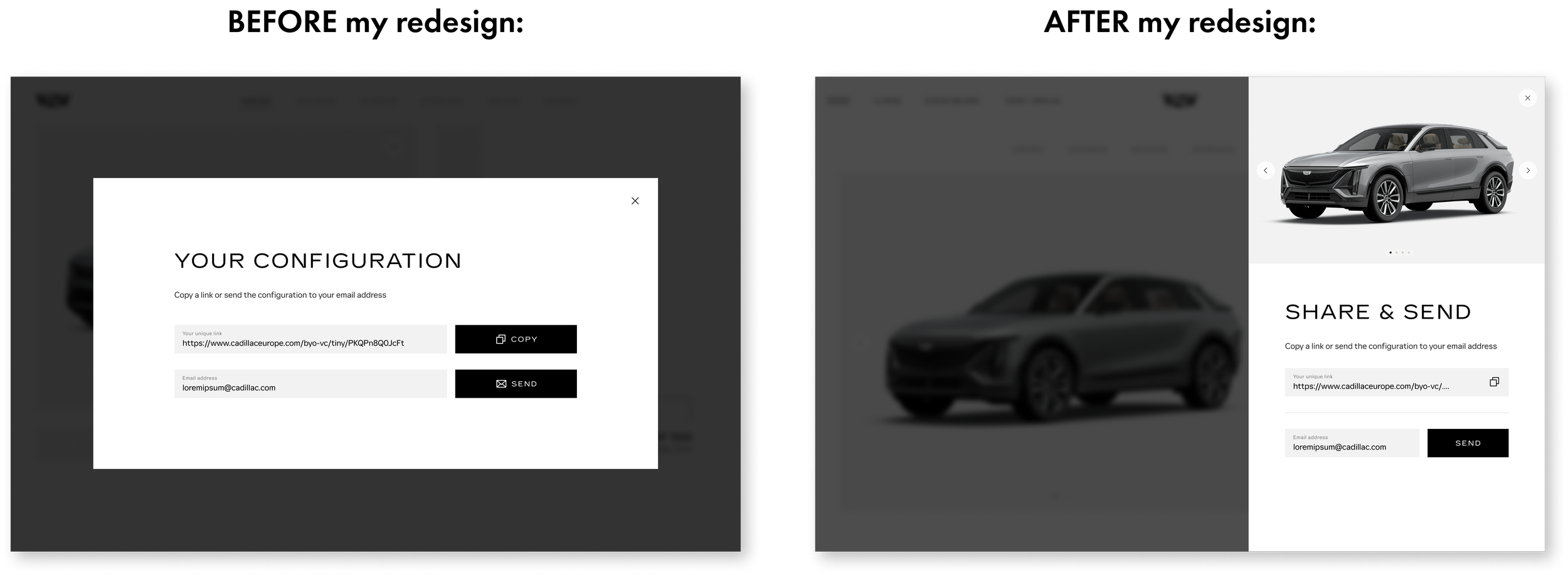
My assignment was to redesign our modals to give them a more “premium” feel, paying attention to open/close animations, visuals, and use of space.
My assignment was to redesign our modals to give them a more “premium” feel, paying attention to open/close animations, visuals, and use of space.
My assignment was to redesign our modals to give them a more “premium” feel, paying attention to open/close animations, visuals, and use of space.
My designs feature 2 modal styles: a narrow, edge-aligned modal for text-led, legalese modals, and a wide-screen modal for editorial-style popups for text with accompanying imagery and interactive components.
My assignment was to redesign our modals to give them a more “premium” feel, paying attention to open/close animations, visuals, and use of space.
When navigating through the prototype, red triangles note which clickable elements open up a modal:
My assignment was to redesign our modals to give them a more “premium” feel, paying attention to open/close animations, visuals, and use of space.
Play desktop prototype
Play mobile prototype
New landing pages
Net-new landing pages for Cadillac Europe’s marketing website, available in multiple European locales including Switzerland, France, Sweden, and Germany.
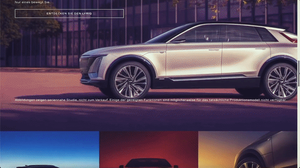
OPTIQ PDP
My designs for the product detail page for the OPTIQ electric vehicle. Not ready to be configured and sold, this page offers a “sneak peek” of what is soon to come.
View live page
When navigating through the prototype, red triangles note which clickable elements open up a modal:
My assignment was to redesign our modals to give them a more “premium” feel, paying attention to open/close animations, visuals, and use of space.
Play desktop prototype
Play mobile prototype
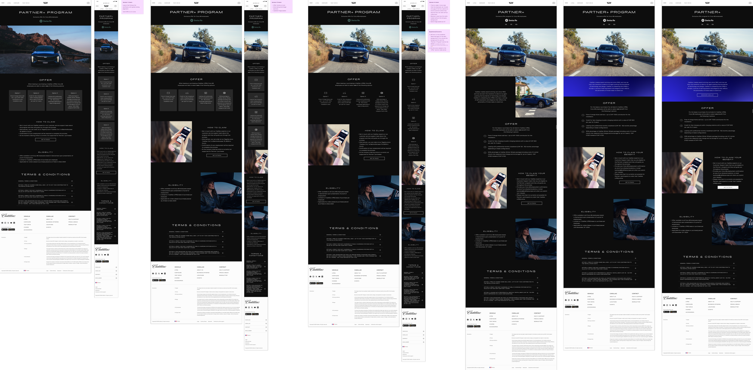
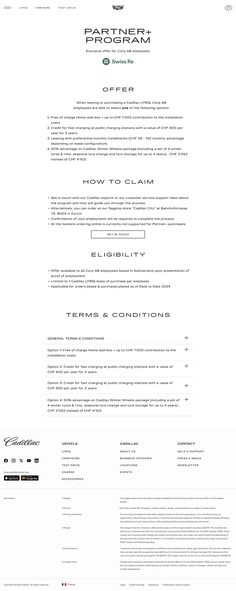
Partner+ Program
My designs for a landing page available to employees of partnering companies on how to redeem LYRIQ specials.
This page is only accessible via a unique link provided to these employees. It cannot be found organically via the site or a search engine.
Sitemaps
Mobile App
MyCadillac Eu
I contributed to the vehicle owner app MyCadillac for EU via designing screens for internet outage scenarios and other screens for updating vehicle data within the app.
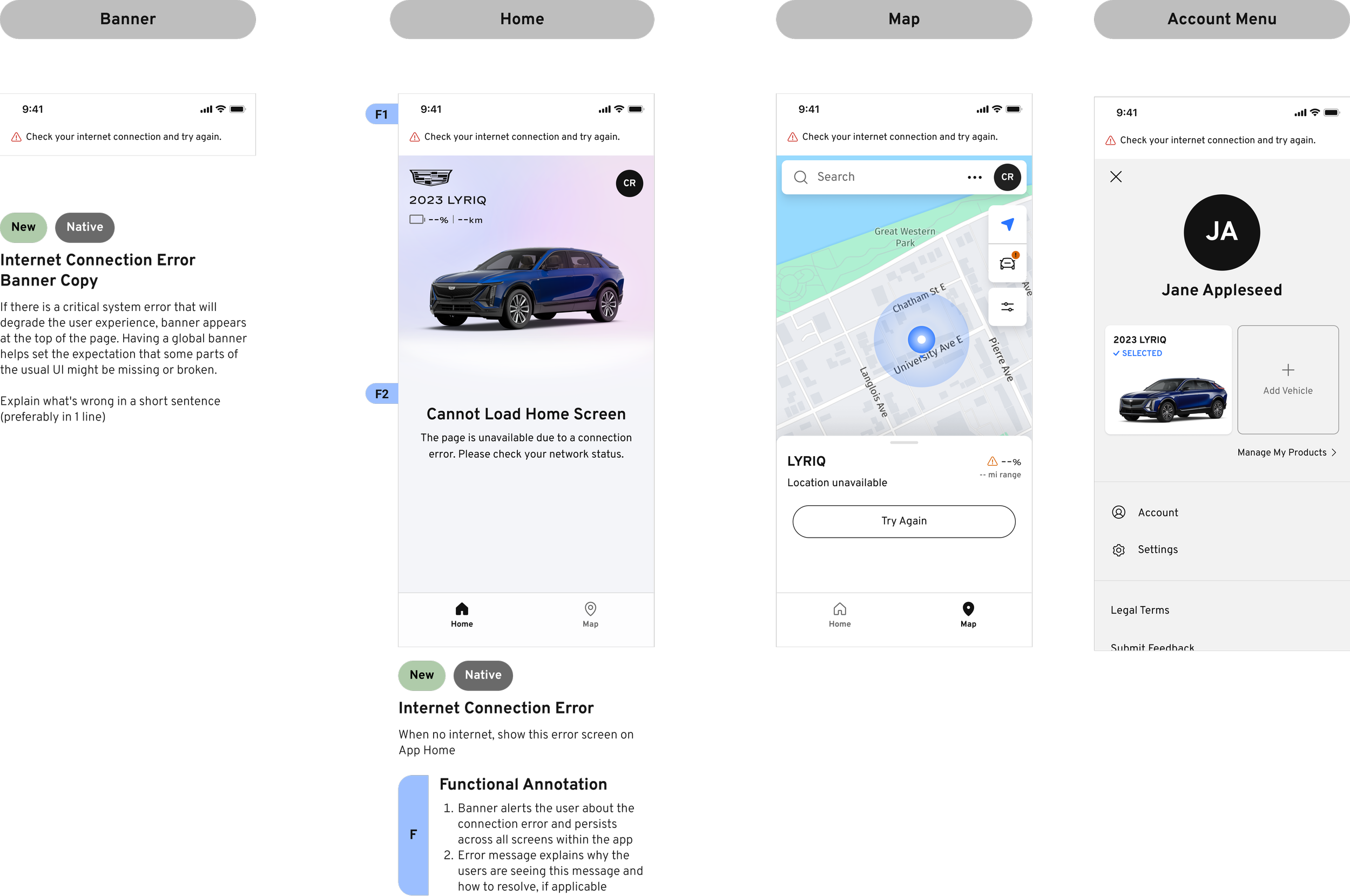
No internet scenarios
Users will receive a persistent banner message that does not go away until connection is reestablished.
The app will search for a new connection every 5 seconds, so no in-app action is necessary for the user.
Only some cached data is still available:
- If the user has the owner’s manual cached, they can still access it. This is information does not regularly update, so it’s okay to show
- EV battery levels will not be displayed, as it can easily be inaccurate and could pose problems for the user if their battery shows a high percentage when it is actually low
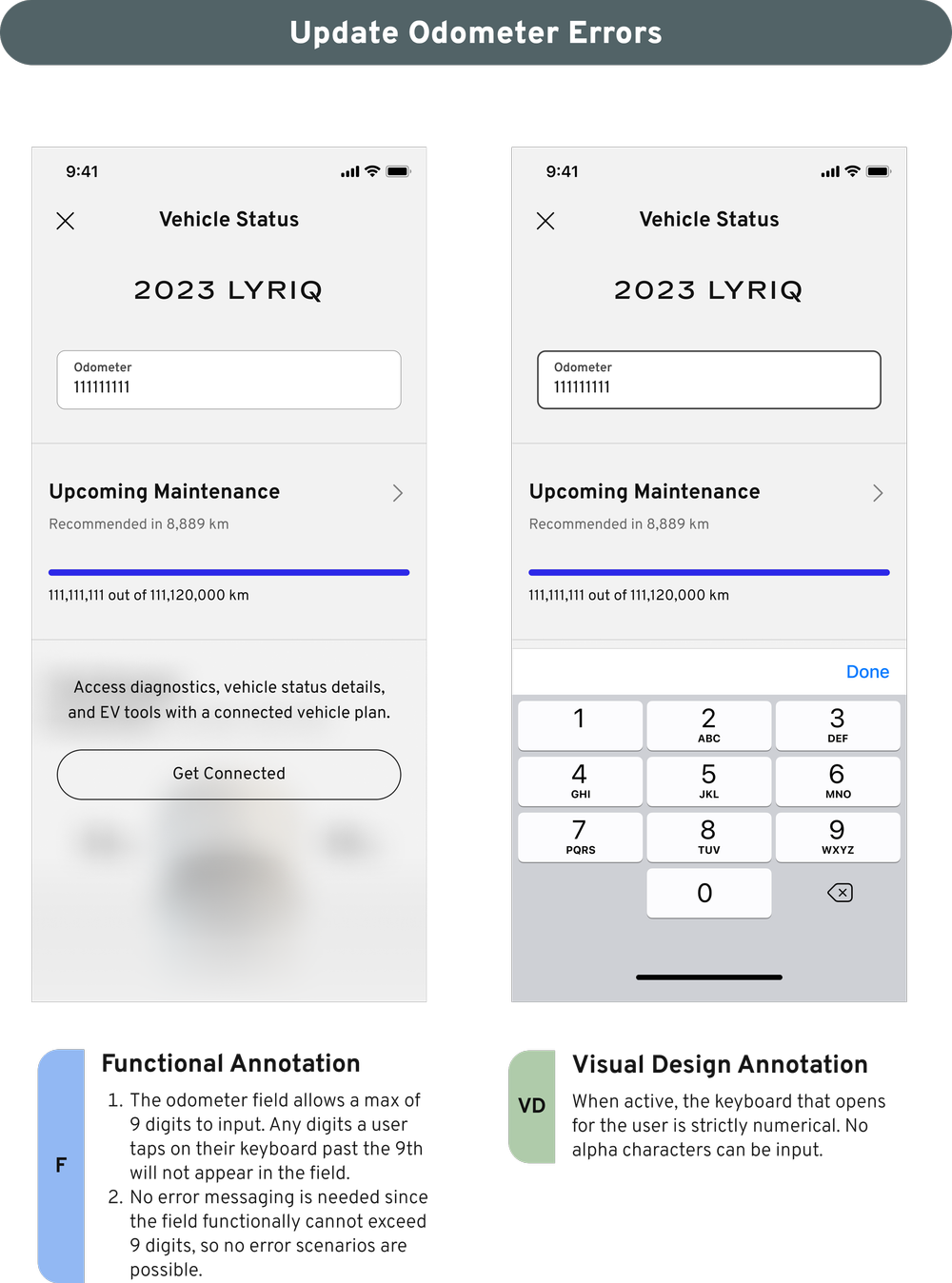
Odometer errors
The business ask was to design an error message that displays when the user enters more than 9 characters to the odometer input field.
Instead, I advocated for a design where the field simply caps at 9 characters, preventing an error scenario. Additionally, since the keyboard to input characters is numbers-only, not invalid characters can be input either, keeping users on a happy path.
Swiss marketing site redesign
The complete redesign of the Cadillac Switzerland marketing website under the new Cadillac visual identity system.
Project background
In 2021, Cadillac was expanding back into Europe with Switzerland selected as the “test market”. The idea was simple: launch the brand in this test market, see how well it performs, and then expand into more European markets. At the end Q4 2021, the first release of this Swiss Cadillac website was released.
At the same time the Swiss Cadillac site began rollout, the Cadillac brand launched a brand new visual identity system, so at the time of Swiss launch, the existing entire site experience was dated and unreflective of the new brand. There was an instant business need to completely overhaul and redesign the site to reflect the new visual guidelines and shift the tone/mood of the web experience.
I was singularly tasked with redesigning the content of the full Cadillac EU brand site experience. This meant updating the entire design to the new visual identity system, maintaining copy/content but redesigning the layout, componentry, typography, color applications, and overall look/feel while maintaining the same core content to support the new vision of “Be Iconic”.
Overview
🙋🏻♀️
My role
- VisID translation
- Small/Medium/Large Viewport Mockups
- Photographic touchups
🕚
Timing/efforts
- ~12 weeks (target August 22 - 120th anniversary of Cadillac)
- ~27 core pages, 20 footer pages, 120+ mockups
🎨
Design team
- Vanessa Martin - Lead Designer
- Julius Mun - Cadillac Visual Design Leader
🖥️
Product team
- Vanessa Martin - UX Designer
- Leslie Ruiz Irizarry - Product Owner
- Renee Peters - Product Owner
- Shelley Wen - Project and Program Management
- Olivier della Valle - Associate Manager Brand Marketing, Cadillac Europe
- Xiaolin Qiu - IT Innovation Manager
- Janelle Garcia - Software Developer
- Jerry Abah - Software Developer
- Rudy Valdez - Software Developer
- Armando Gonzalez - Software Developer
- Zachary Flynn - Software Developer
- Derrick Mullins - Software Developer
- Alok Roy Chatterjee - Software Developer
- Ersoy Demir - Software Developer
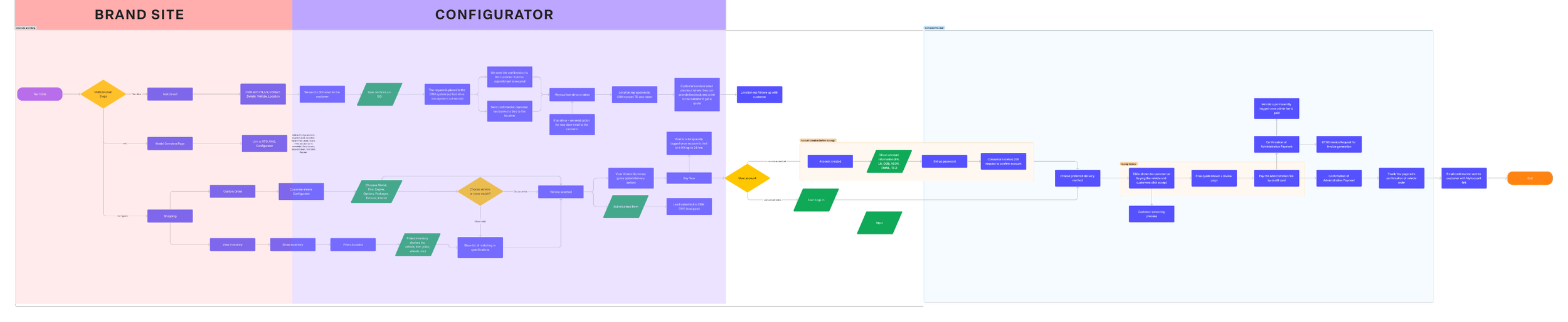
Customer journey
It is important to understand at what touchpoints in the customer journey our users are at when engaging with specific features. A high-level customer journey map allowed me to gain a high-level understanding of what paths a user may encounter after engaging with our brand site.
With Configurator following the Brand Site experience, I need to make sure to best to present information and features on Model Overview pages to users in the most efficient way that balanced mood with readability/clarity.
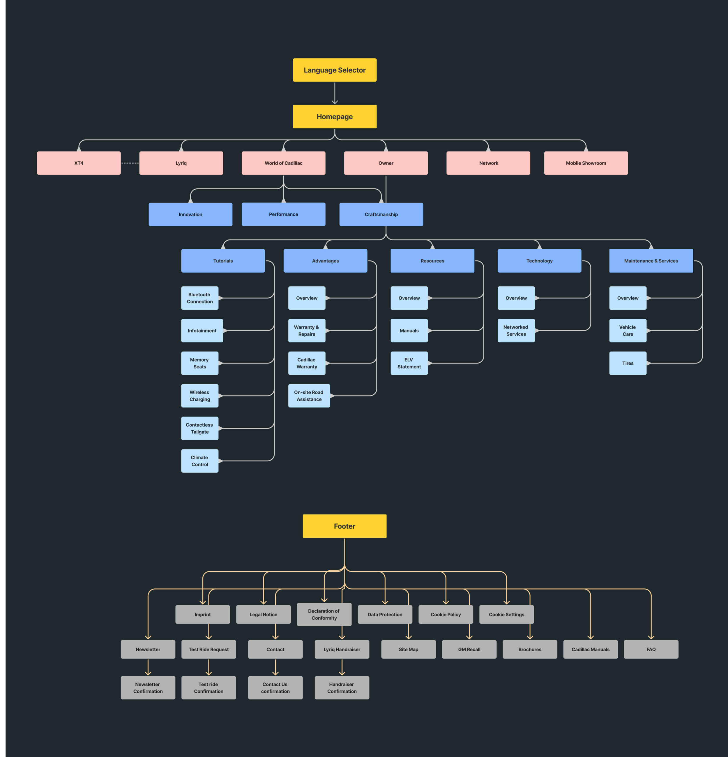
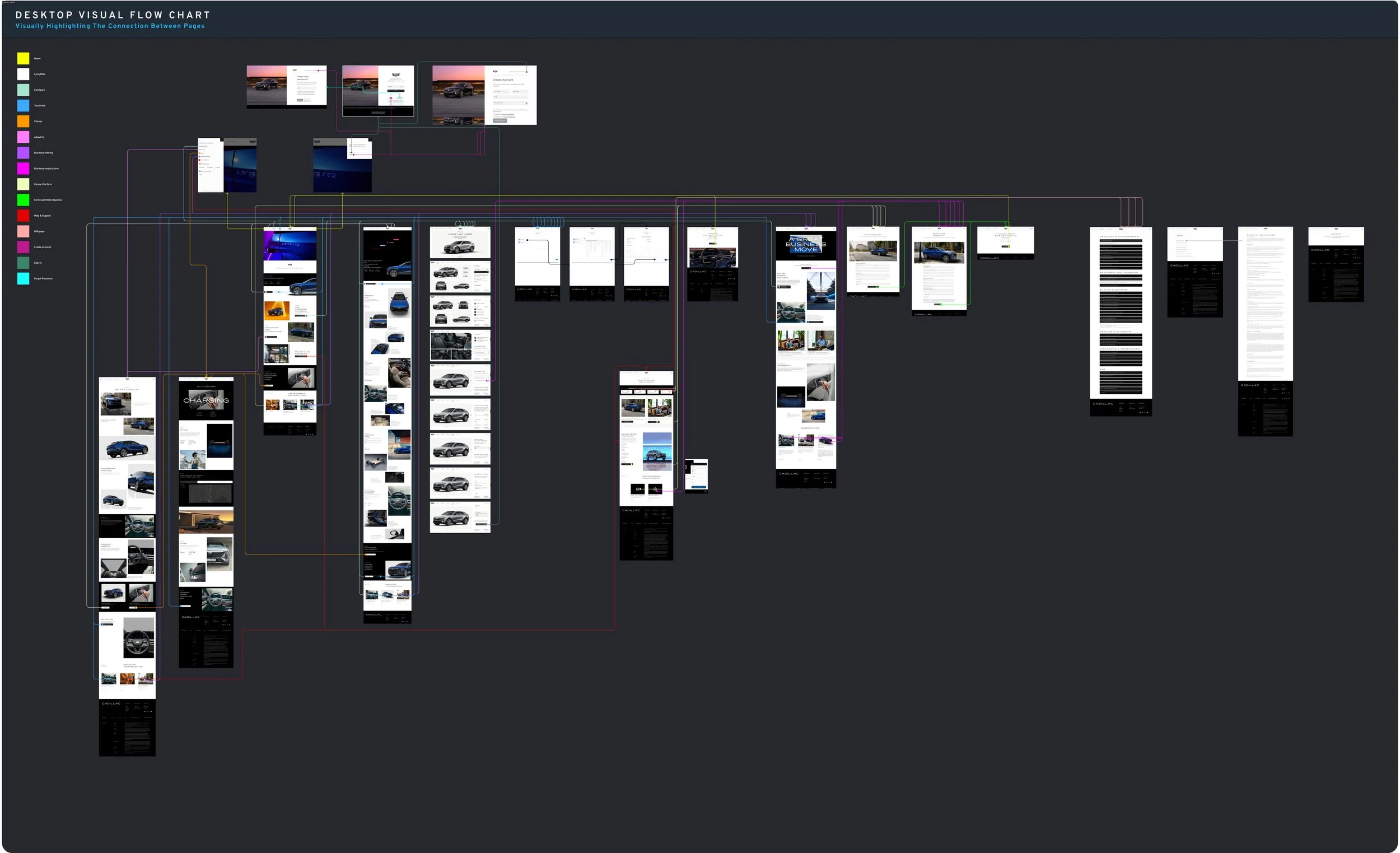
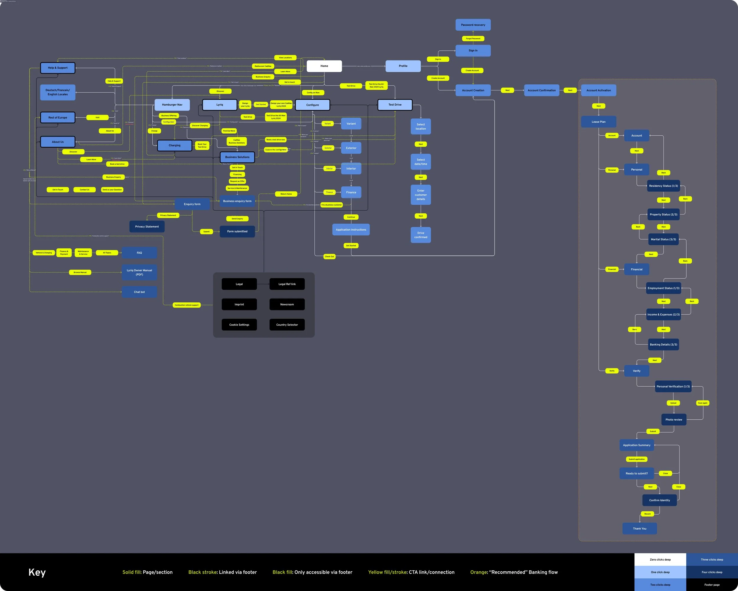
Sitemap
I created a sitemap to identify all the different possible touchpoints on the Brand Site prior to Configurator. Not only did this help to gauge the scope of work, but also allowed me to understand the flow of the site and see how I can use design motifs across the site to create navigational cues and create a sense of page hierarchy when actively engaging with the site.
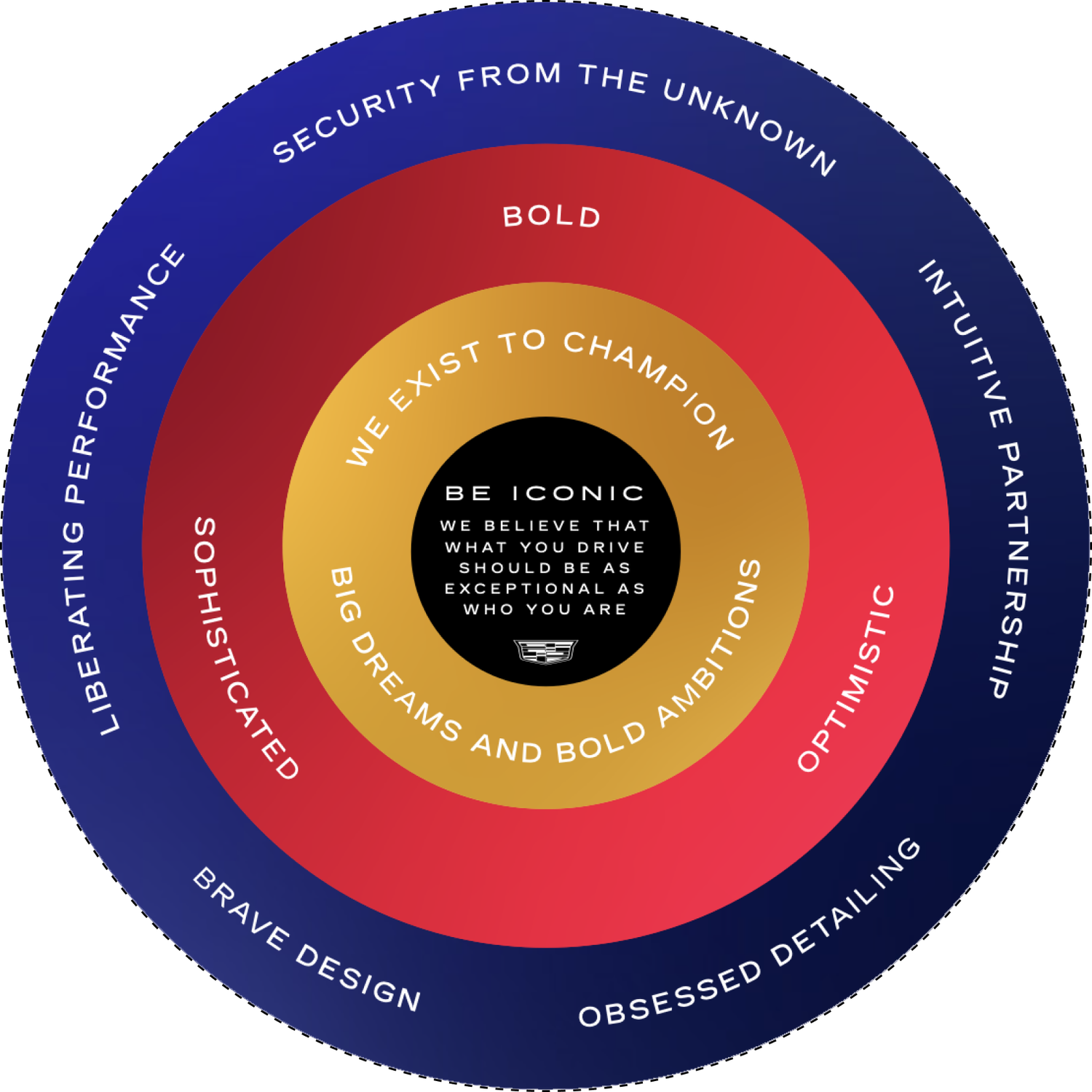
Visual identity study
Before designing any mockups, I spent time thoroughly studying the new Visual Identity System documentation. Key objectives I made sure to keep in mind during the design process included:
- Use boldly optimistic imagery
- Lead with black
- Define a uniquely Cadillac take on the EV future
- Elevate Cadillac’s expression of luxury
- Humanize the brand experience
- Resonate with more people in more places
- Capture compelling human emotion
- Make reductivity feel rich and experiential
- Create room to breathe and move
- Create a uniquely Cadillac imagery POV
Internationalization (i18n)
The official languages of Switzerland are Swiss German and French, so mockups would need to be designed for these languages.
However, some words in German can be much longer than their French counterparts. Furthermore, the new Cadillac heading font featured very wide letters with deep kerning, making already very long words even longer.
I took considerations on how best to fit these long German words on single lines at smaller viewports. I wanted to avoid breaking single words across multiple lines at all costs.
Model Touchups: NA to EU
Many photographic assets needed touchups. All of the photographic assets- save for Lyriq showcar images- were of US model vehicles. However, US and EU models are different; European models may not have all the same features as US models.
For example, in the EU, tail lights are clear unless braking or indicating. When indicating, they must flash amber, and for braking the must flash red. US law, however, allows both indicators and brake lights to be red.
VisID Photo Alignment
Many photographic elements in the asset library did not have versions updated to the new visual identity system. In addition, at the time of design, the new photo asset library was rather small.
To keep from reusing the same new photographic assets over and over, I strategically cropped new VisID photos in various spots to create multiple photos from one. I also took old photographic assets into Photoshop to update their color schemes to match that of the new visual identity system.
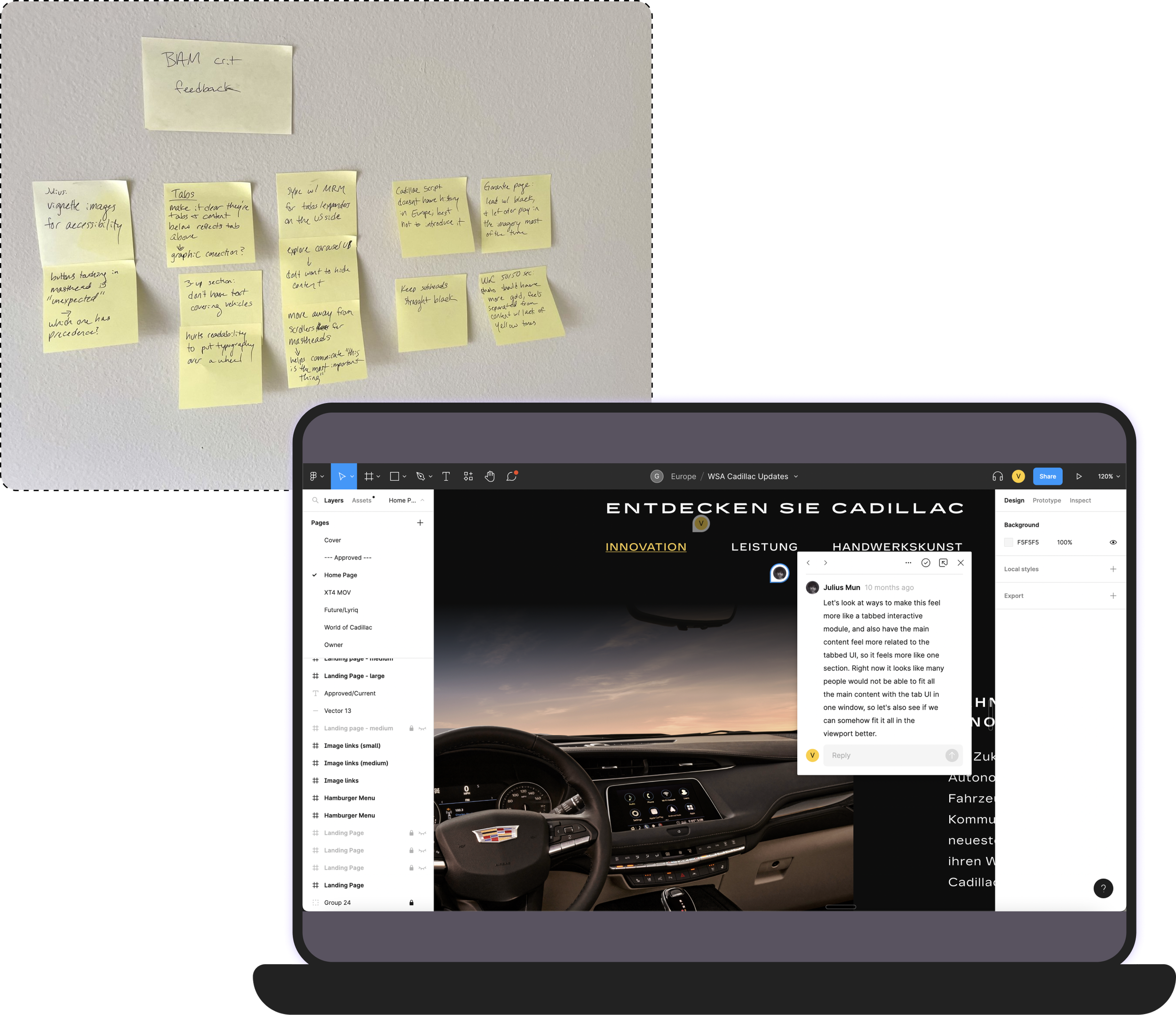
Collaboration
I took my work weekly into several review forums to hold myself accountable in keeping my work aligned to the brand vision while maintaining best design practices.
Seeking this feedback was critical since I would otherwise be working in a design silo and could have derailed.
- BAM (Brand Alignment Meeting)
- 70+ design attendees including Cadillac senior visual design leaders
- Critiques and feedback exchanged
- Weekly design team reviews
- Internal D2C critiques
- 1on1 reviews with senior design leadership
- Mockup reviews with developers to ensure technical feasibility
- Weekly mockup reviews
- Feat EU business stakeholders & product owners
Usability updates
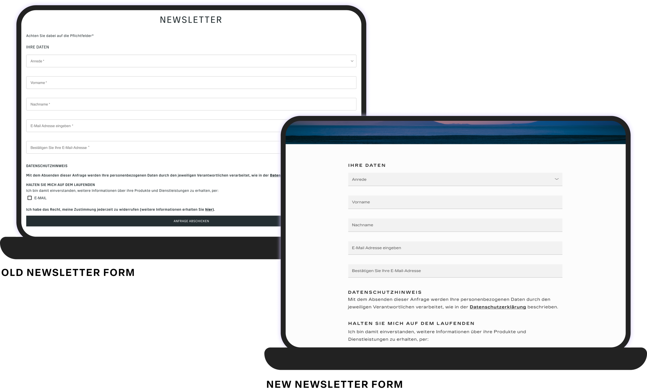
Key updates were made to refined mockups to increase accessibility and usability of interactive pages.For example, old form submissions featured input fields that spanned the full width of the screen and marked every field as required.
The new form submission style features more readable field widths, and fields marked only if they are optional via assistive text; common sense dictates that most fields are required, so it does not make sense to apply “*required” to fields.
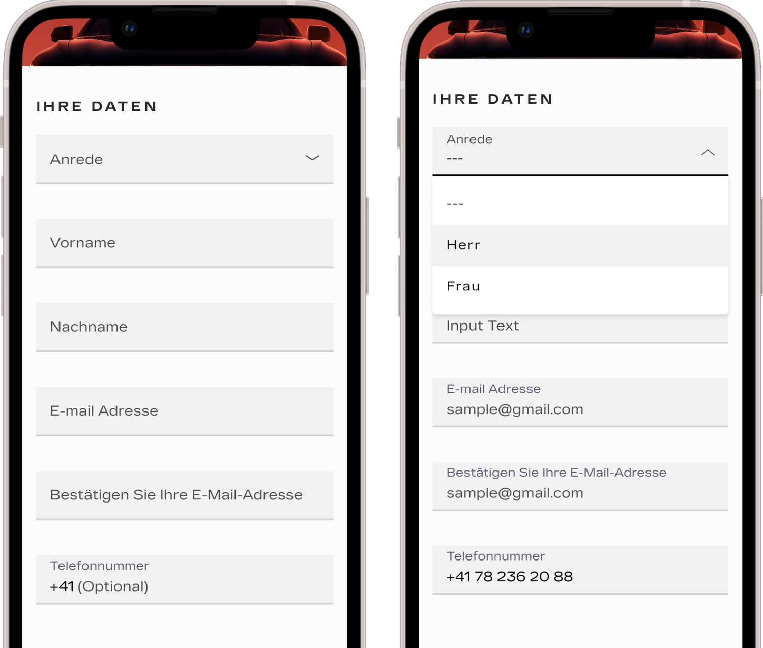
Accessibility (a11y)
I made sure to check my mockups against WCAG compliance.
- Text for mobile does not go smaller than 16px
- Color contrasts meet a minimum 3:1 ratio for large text (18pt and larger, or at least 14pt and bold) and 4.5:1 for normal text (17pt and smaller)
- Nontext elements meet a contrast ratio of 3:1
- Touch targets are min 48x48px
- Placeholder text does not replace labels or instructions in form fields
- Interactive controls have a focus state
Key mockups
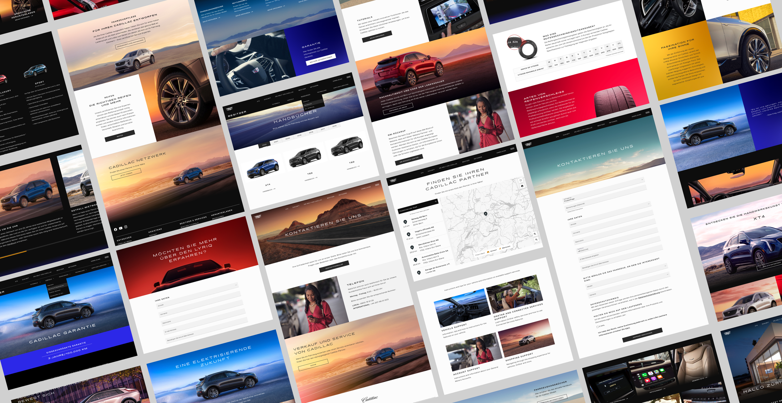
I delivered over 100 design mockups to provide new comps for every page on the site. This includes help tools, footer links, about pages, and menus for small, medium, and large viewports.
User acceptance testing
During the time of UAT testing, myself and developers Derrick Mullins and Rudy Valdez were available for ad hoc huddles to evaluate coded features for discrepancies to design and accessibility. These efforts were necessary to deliver the site on time and without critical errors.
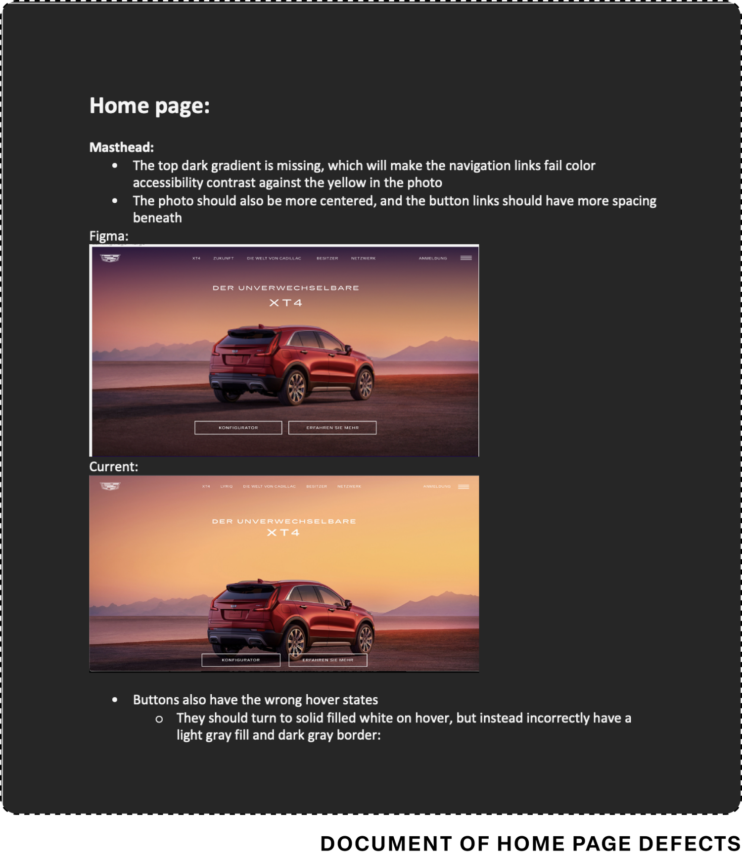
I created Word docs to list out defects from Design to Feature, highlighting what was wrong and what needed to be done to remedy the page.
Dev C&E Product Showcase
On November 29th, myself, the Product Owner Renee Peters, and Brand Marketing Manager Oliver della Valle presented a demo of the newly designed brand site in the Dev C&E Product Showcase, a 400+ attendee meeting of studio members across the DevIT space.
This work remained live for Cadillac Europe from summer 2021 to summer 2023, where it was replaced with the new version live today.
Back to home
Configurator
The Configurator is Cadillac’s build-your-own shopping tool where customers can design and purchase their own electric vehicle entirely from home.
Modals
My assignment was to redesign our modals to give them a more “premium” feel, paying attention to open/close animations, visuals, and use of space.
My assignment was to redesign our modals to give them a more “premium” feel, paying attention to open/close animations, visuals, and use of space.
My assignment was to redesign our modals to give them a more “premium” feel, paying attention to open/close animations, visuals, and use of space.
My designs feature 2 modal styles: a narrow, edge-aligned modal for text-led, legalese modals, and a wide-screen modal for editorial-style popups for text with accompanying imagery and interactive components.
My assignment was to redesign our modals to give them a more “premium” feel, paying attention to open/close animations, visuals, and use of space.
When navigating through the prototype, red triangles note which clickable elements open up a modal:
My assignment was to redesign our modals to give them a more “premium” feel, paying attention to open/close animations, visuals, and use of space.
Play desktop prototype
Play mobile prototype
New landing pages
Net-new landing pages for Cadillac Europe’s marketing website, available in multiple European locales including Switzerland, France, Sweden, and Germany.
OPTIQ PDP
My designs for the product detail page for the OPTIQ electric vehicle. Not ready to be configured and sold, this page offers a “sneak peek” of what is soon to come.
View live page
When navigating through the prototype, red triangles note which clickable elements open up a modal:
My assignment was to redesign our modals to give them a more “premium” feel, paying attention to open/close animations, visuals, and use of space.
Play desktop prototype
Play mobile prototype
Partner+ Program
My designs for a landing page available to employees of partnering companies on how to redeem LYRIQ specials.
This page is only accessible via a unique link provided to these employees. It cannot be found organically via the site or a search engine.
Sitemaps
Mobile App
MyCadillac Eu
I contributed to the vehicle owner app MyCadillac for EU via designing screens for internet outage scenarios and other screens for updating vehicle data within the app.
No internet scenarios
Users will receive a persistent banner message that does not go away until connection is reestablished.
The app will search for a new connection every 5 seconds, so no in-app action is necessary for the user.
Only some cached data is still available:
- If the user has the owner’s manual cached, they can still access it. This is information does not regularly update, so it’s okay to show
- EV battery levels will not be displayed, as it can easily be inaccurate and could pose problems for the user if their battery shows a high percentage when it is actually low
Odometer errors
The business ask was to design an error message that displays when the user enters more than 9 characters to the odometer input field.
Instead, I advocated for a design where the field simply caps at 9 characters, preventing an error scenario. Additionally, since the keyboard to input characters is numbers-only, not invalid characters can be input either, keeping users on a happy path.
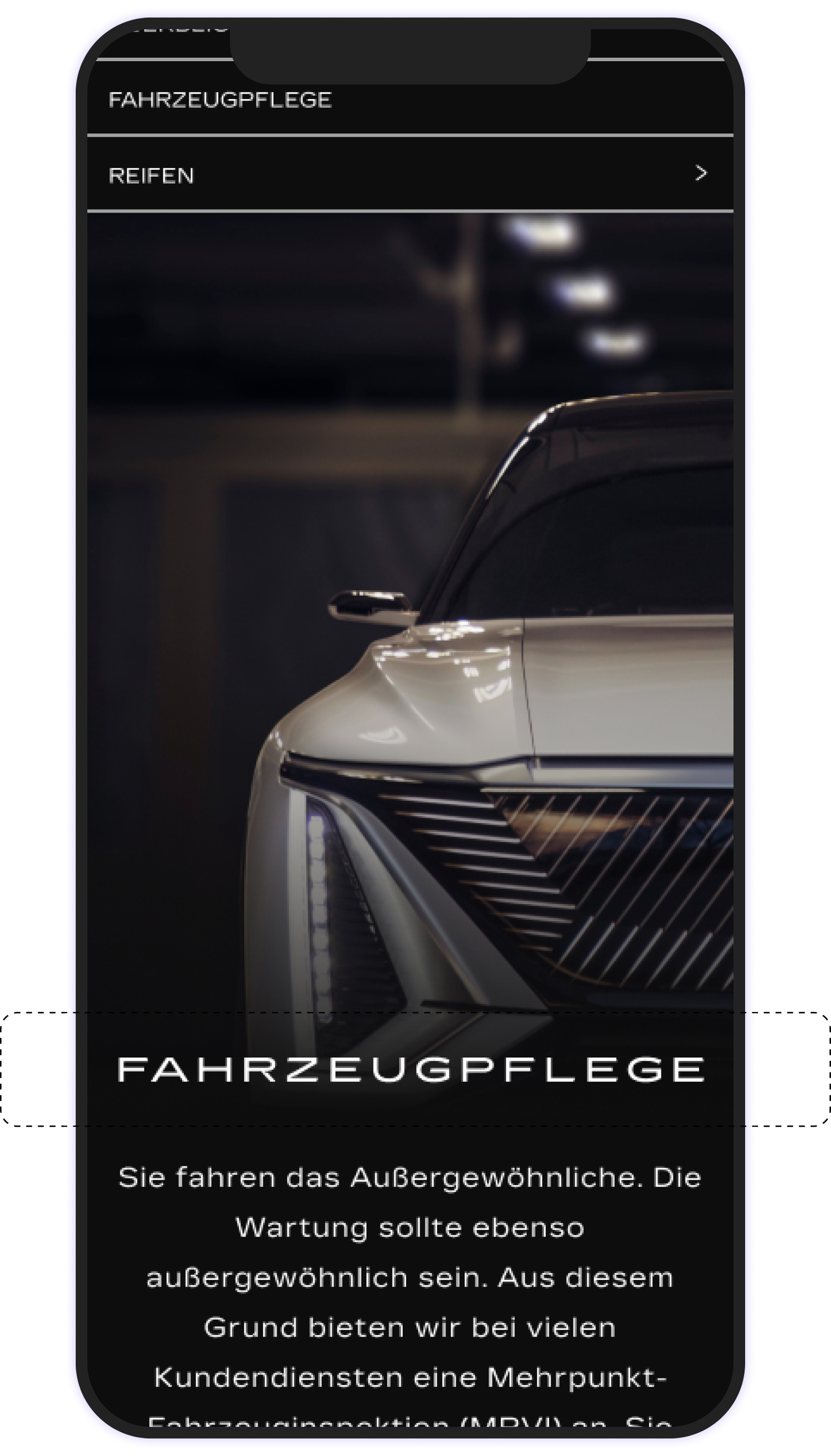
Swiss marketing site redesign
The complete redesign of the Cadillac Switzerland marketing website under the new Cadillac visual identity system.
Project background
In 2021, Cadillac was expanding back into Europe with Switzerland selected as the “test market”. The idea was simple: launch the brand in this test market, see how well it performs, and then expand into more European markets. At the end Q4 2021, the first release of this Swiss Cadillac website was released.
At the same time the Swiss Cadillac site began rollout, the Cadillac brand launched a brand new visual identity system, so at the time of Swiss launch, the existing entire site experience was dated and unreflective of the new brand. There was an instant business need to completely overhaul and redesign the site to reflect the new visual guidelines and shift the tone/mood of the web experience.
I was singularly tasked with redesigning the content of the full Cadillac EU brand site experience. This meant updating the entire design to the new visual identity system, maintaining copy/content but redesigning the layout, componentry, typography, color applications, and overall look/feel while maintaining the same core content to support the new vision of “Be Iconic”.
Overview
🙋🏻♀️
My role
- VisID translation
- Small/Medium/Large Viewport Mockups
- Photographic touchups
🕚
Timing/efforts
- ~12 weeks (target August 22 - 120th anniversary of Cadillac)
- ~27 core pages, 20 footer pages, 120+ mockups
🎨
Design team
- Vanessa Martin - Lead Designer
- Julius Mun - Cadillac Visual Design Leader
🖥️
Product team
- Vanessa Martin - UX Designer
- Leslie Ruiz Irizarry - Product Owner
- Renee Peters - Product Owner
- Shelley Wen - Project and Program Management
- Olivier della Valle - Associate Manager Brand Marketing, Cadillac Europe
- Xiaolin Qiu - IT Innovation Manager
- Janelle Garcia - Software Developer
- Jerry Abah - Software Developer
- Rudy Valdez - Software Developer
- Armando Gonzalez - Software Developer
- Zachary Flynn - Software Developer
- Derrick Mullins - Software Developer
- Alok Roy Chatterjee - Software Developer
- Ersoy Demir - Software Developer
Customer journey
It is important to understand at what touchpoints in the customer journey our users are at when engaging with specific features. A high-level customer journey map allowed me to gain a high-level understanding of what paths a user may encounter after engaging with our brand site.
With Configurator following the Brand Site experience, I need to make sure to best to present information and features on Model Overview pages to users in the most efficient way that balanced mood with readability/clarity.
Sitemap
I created a sitemap to identify all the different possible touchpoints on the Brand Site prior to Configurator. Not only did this help to gauge the scope of work, but also allowed me to understand the flow of the site and see how I can use design motifs across the site to create navigational cues and create a sense of page hierarchy when actively engaging with the site.
Visual identity study
Before designing any mockups, I spent time thoroughly studying the new Visual Identity System documentation. Key objectives I made sure to keep in mind during the design process included:
- Use boldly optimistic imagery
- Lead with black
- Define a uniquely Cadillac take on the EV future
- Elevate Cadillac’s expression of luxury
- Humanize the brand experience
- Resonate with more people in more places
- Capture compelling human emotion
- Make reductivity feel rich and experiential
- Create room to breathe and move
- Create a uniquely Cadillac imagery POV
Internationalization (i18n)
The official languages of Switzerland are Swiss German and French, so mockups would need to be designed for these languages.
However, some words in German can be much longer than their French counterparts. Furthermore, the new Cadillac heading font featured very wide letters with deep kerning, making already very long words even longer.
I took considerations on how best to fit these long German words on single lines at smaller viewports. I wanted to avoid breaking single words across multiple lines at all costs.
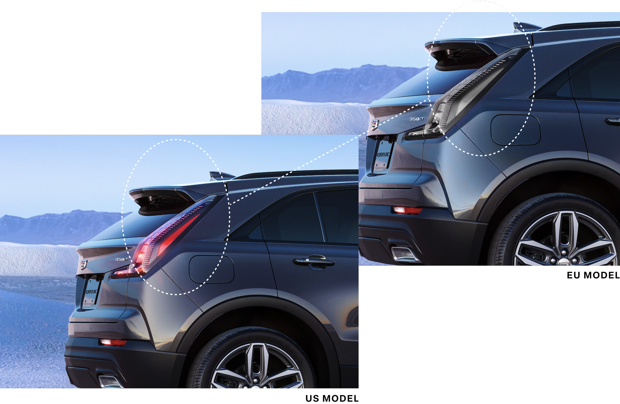
Model Touchups: NA to EU
Many photographic assets needed touchups. All of the photographic assets- save for Lyriq showcar images- were of US model vehicles. However, US and EU models are different; European models may not have all the same features as US models.
For example, in the EU, tail lights are clear unless braking or indicating. When indicating, they must flash amber, and for braking the must flash red. US law, however, allows both indicators and brake lights to be red.
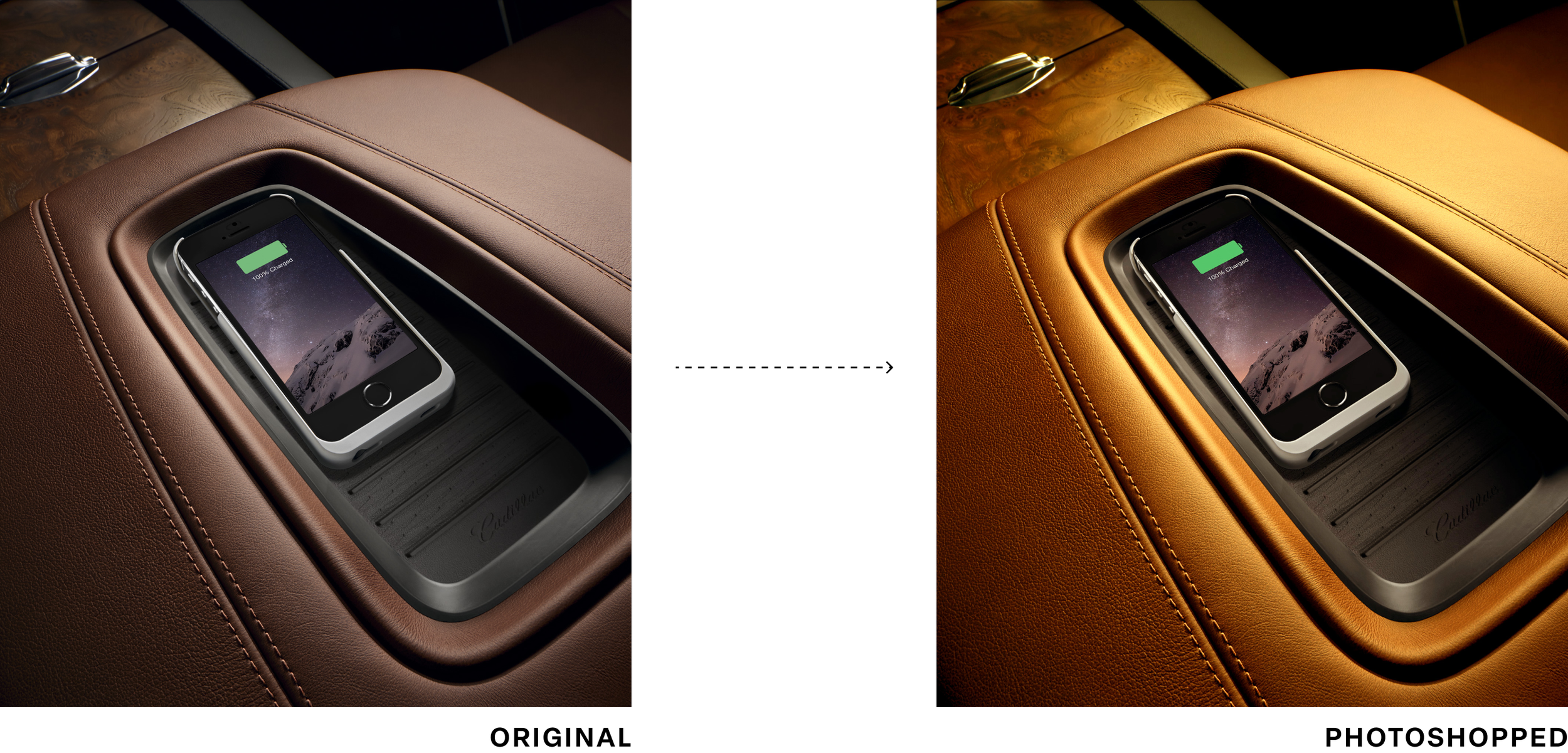
VisID Photo Alignment
Many photographic elements in the asset library did not have versions updated to the new visual identity system. In addition, at the time of design, the new photo asset library was rather small.
To keep from reusing the same new photographic assets over and over, I strategically cropped new VisID photos in various spots to create multiple photos from one. I also took old photographic assets into Photoshop to update their color schemes to match that of the new visual identity system.
Collaboration
I took my work weekly into several review forums to hold myself accountable in keeping my work aligned to the brand vision while maintaining best design practices.
Seeking this feedback was critical since I would otherwise be working in a design silo and could have derailed.
- BAM (Brand Alignment Meeting)
- 70+ design attendees including Cadillac senior visual design leaders
- Critiques and feedback exchanged
- Weekly design team reviews
- Internal D2C critiques
- 1on1 reviews with senior design leadership
- Mockup reviews with developers to ensure technical feasibility
- Weekly mockup reviews
- Feat EU business stakeholders & product owners
Usability updates
Key updates were made to refined mockups to increase accessibility and usability of interactive pages.For example, old form submissions featured input fields that spanned the full width of the screen and marked every field as required.
The new form submission style features more readable field widths, and fields marked only if they are optional via assistive text; common sense dictates that most fields are required, so it does not make sense to apply “*required” to fields.
Accessibility (a11y)
I made sure to check my mockups against WCAG compliance.
- Text for mobile does not go smaller than 16px
- Color contrasts meet a minimum 3:1 ratio for large text (18pt and larger, or at least 14pt and bold) and 4.5:1 for normal text (17pt and smaller)
- Nontext elements meet a contrast ratio of 3:1
- Touch targets are min 48x48px
- Placeholder text does not replace labels or instructions in form fields
- Interactive controls have a focus state
Key mockups
I delivered over 100 design mockups to provide new comps for every page on the site. This includes help tools, footer links, about pages, and menus for small, medium, and large viewports.
User acceptance testing
During the time of UAT testing, myself and developers Derrick Mullins and Rudy Valdez were available for ad hoc huddles to evaluate coded features for discrepancies to design and accessibility. These efforts were necessary to deliver the site on time and without critical errors.
I created Word docs to list out defects from Design to Feature, highlighting what was wrong and what needed to be done to remedy the page.
Dev C&E Product Showcase
On November 29th, myself, the Product Owner Renee Peters, and Brand Marketing Manager Oliver della Valle presented a demo of the newly designed brand site in the Dev C&E Product Showcase, a 400+ attendee meeting of studio members across the DevIT space.
This work remained live for Cadillac Europe from summer 2021 to summer 2023, where it was replaced with the new version live today.
Back to home
Configurator
The Configurator is Cadillac’s build-your-own shopping tool where customers can design and purchase their own electric vehicle entirely from home.
Modals
My assignment was to redesign our modals to give them a more “premium” feel, paying attention to open/close animations, visuals, and use of space.
I benchmarked brands like Rivian, Apple, Cowboy ebikes, and Porsche to seek inspiration, and pulled from them elements that I thought would elevate our modals and make them more premium.
My designs underwent multiple iterations and feedback rounds from the design team. The designs below are the final version.
My designs feature 2 modal styles: a narrow, edge-aligned modal for text-led, legalese modals, and a wide-screen modal for editorial-style popups for text with accompanying imagery and interactive components.
The solutions optimize line-length for readability, optimize screen realty, a provide a luxury feel that matches the brand and product.
When navigating through the prototype, red triangles note which clickable elements open up a modal:
The solutions optimize line-length for readability, optimize screen realty, a provide a luxury feel that matches the brand and product.
Play desktop prototype
Play mobile prototype
New landing pages
Net-new landing pages for Cadillac Europe’s marketing website, available in multiple European locales including Switzerland, France, Sweden, and Germany.
OPTIQ PDP
My designs for the product detail page for the OPTIQ electric vehicle. Not ready to be configured and sold, this page offers a “sneak peek” of what is soon to come.
View live page
When navigating through the prototype, red triangles note which clickable elements open up a modal:
The solutions optimize line-length for readability, optimize screen realty, a provide a luxury feel that matches the brand and product.
Play desktop prototype
Play mobile prototype
Partner+ Program
My designs for a landing page available to employees of partnering companies on how to redeem LYRIQ specials.
This page is only accessible via a unique link provided to these employees. It cannot be found organically via the site or a search engine.
Sitemaps
Mobile App
MyCadillac Eu
I contributed to the vehicle owner app MyCadillac for EU via designing screens for internet outage scenarios and other screens for updating vehicle data within the app.
No internet scenarios
Users will receive a persistent banner message that does not go away until connection is reestablished.
The app will search for a new connection every 5 seconds, so no in-app action is necessary for the user.
Only some cached data is still available:
- If the user has the owner’s manual cached, they can still access it. This is information does not regularly update, so it’s okay to show
- EV battery levels will not be displayed, as it can easily be inaccurate and could pose problems for the user if their battery shows a high percentage when it is actually low
Odometer errors
The business ask was to design an error message that displays when the user enters more than 9 characters to the odometer input field.
Instead, I advocated for a design where the field simply caps at 9 characters, preventing an error scenario. Additionally, since the keyboard to input characters is numbers-only, not invalid characters can be input either, keeping users on a happy path.
Swiss marketing site redesign
The complete redesign of the Cadillac Switzerland marketing website under the new Cadillac visual identity system.
Project background
In 2021, Cadillac was expanding back into Europe with Switzerland selected as the “test market”. The idea was simple: launch the brand in this test market, see how well it performs, and then expand into more European markets. At the end Q4 2021, the first release of this Swiss Cadillac website was released.
At the same time the Swiss Cadillac site began rollout, the Cadillac brand launched a brand new visual identity system, so at the time of Swiss launch, the existing entire site experience was dated and unreflective of the new brand. There was an instant business need to completely overhaul and redesign the site to reflect the new visual guidelines and shift the tone/mood of the web experience.
I was singularly tasked with redesigning the content of the full Cadillac EU brand site experience. This meant updating the entire design to the new visual identity system, maintaining copy/content but redesigning the layout, componentry, typography, color applications, and overall look/feel while maintaining the same core content to support the new vision of “Be Iconic”.
Overview
🙋🏻♀️
My role
- VisID translation
- Small/Medium/Large Viewport Mockups
- Photographic touchups
🕚
Timing/efforts
- ~12 weeks (target August 22 - 120th anniversary of Cadillac)
- ~27 core pages, 20 footer pages, 120+ mockups
🎨
Design team
- Vanessa Martin - Lead Designer
- Julius Mun - Cadillac Visual Design Leader
🖥️
Product team
- Vanessa Martin - UX Designer
- Leslie Ruiz Irizarry - Product Owner
- Renee Peters - Product Owner
- Shelley Wen - Project and Program Management
- Olivier della Valle - Associate Manager Brand Marketing, Cadillac Europe
- Xiaolin Qiu - IT Innovation Manager
- Janelle Garcia - Software Developer
- Jerry Abah - Software Developer
- Rudy Valdez - Software Developer
- Armando Gonzalez - Software Developer
- Zachary Flynn - Software Developer
- Derrick Mullins - Software Developer
- Alok Roy Chatterjee - Software Developer
- Ersoy Demir - Software Developer
Customer journey
It is important to understand at what touchpoints in the customer journey our users are at when engaging with specific features. A high-level customer journey map allowed me to gain a high-level understanding of what paths a user may encounter after engaging with our brand site.
With Configurator following the Brand Site experience, I need to make sure to best to present information and features on Model Overview pages to users in the most efficient way that balanced mood with readability/clarity.
Sitemap
I created a sitemap to identify all the different possible touchpoints on the Brand Site prior to Configurator. Not only did this help to gauge the scope of work, but also allowed me to understand the flow of the site and see how I can use design motifs across the site to create navigational cues and create a sense of page hierarchy when actively engaging with the site.
Visual identity study
Before designing any mockups, I spent time thoroughly studying the new Visual Identity System documentation. Key objectives I made sure to keep in mind during the design process included:
- Use boldly optimistic imagery
- Lead with black
- Define a uniquely Cadillac take on the EV future
- Elevate Cadillac’s expression of luxury
- Humanize the brand experience
- Resonate with more people in more places
- Capture compelling human emotion
- Make reductivity feel rich and experiential
- Create room to breathe and move
- Create a uniquely Cadillac imagery POV
Internationalization (i18n)
The official languages of Switzerland are Swiss German and French, so mockups would need to be designed for these languages.
However, some words in German can be much longer than their French counterparts. Furthermore, the new Cadillac heading font featured very wide letters with deep kerning, making already very long words even longer.
I took considerations on how best to fit these long German words on single lines at smaller viewports. I wanted to avoid breaking single words across multiple lines at all costs.
Model Touchups: NA to EU
Many photographic assets needed touchups. All of the photographic assets- save for Lyriq showcar images- were of US model vehicles. However, US and EU models are different; European models may not have all the same features as US models.
For example, in the EU, tail lights are clear unless braking or indicating. When indicating, they must flash amber, and for braking the must flash red. US law, however, allows both indicators and brake lights to be red.
VisID Photo Alignment
Many photographic elements in the asset library did not have versions updated to the new visual identity system. In addition, at the time of design, the new photo asset library was rather small.
To keep from reusing the same new photographic assets over and over, I strategically cropped new VisID photos in various spots to create multiple photos from one. I also took old photographic assets into Photoshop to update their color schemes to match that of the new visual identity system.
Collaboration
I took my work weekly into several review forums to hold myself accountable in keeping my work aligned to the brand vision while maintaining best design practices.
Seeking this feedback was critical since I would otherwise be working in a design silo and could have derailed.
- BAM (Brand Alignment Meeting)
- 70+ design attendees including Cadillac senior visual design leaders
- Critiques and feedback exchanged
- Weekly design team reviews
- Internal D2C critiques
- 1on1 reviews with senior design leadership
- Mockup reviews with developers to ensure technical feasibility
- Weekly mockup reviews
- Feat EU business stakeholders & product owners
Usability updates
Key updates were made to refined mockups to increase accessibility and usability of interactive pages.For example, old form submissions featured input fields that spanned the full width of the screen and marked every field as required.
The new form submission style features more readable field widths, and fields marked only if they are optional via assistive text; common sense dictates that most fields are required, so it does not make sense to apply “*required” to fields.
Accessibility (a11y)
I made sure to check my mockups against WCAG compliance.
- Text for mobile does not go smaller than 16px
- Color contrasts meet a minimum 3:1 ratio for large text (18pt and larger, or at least 14pt and bold) and 4.5:1 for normal text (17pt and smaller)
- Nontext elements meet a contrast ratio of 3:1
- Touch targets are min 48x48px
- Placeholder text does not replace labels or instructions in form fields
- Interactive controls have a focus state
Key mockups
I delivered over 100 design mockups to provide new comps for every page on the site. This includes help tools, footer links, about pages, and menus for small, medium, and large viewports.
User acceptance testing
During the time of UAT testing, myself and developers Derrick Mullins and Rudy Valdez were available for ad hoc huddles to evaluate coded features for discrepancies to design and accessibility. These efforts were necessary to deliver the site on time and without critical errors.
I created Word docs to list out defects from Design to Feature, highlighting what was wrong and what needed to be done to remedy the page.
Dev C&E Product Showcase
On November 29th, myself, the Product Owner Renee Peters, and Brand Marketing Manager Oliver della Valle presented a demo of the newly designed brand site in the Dev C&E Product Showcase, a 400+ attendee meeting of studio members across the DevIT space.
This work remained live for Cadillac Europe from summer 2021 to summer 2023, where it was replaced with the new version live today.
Back to home